Some question regarding UI stuff

I have some questions regarding the WatchUI stuff.

1) I do not know where to start looking in the API for the thing I want, because I'm not sure how/what it is called.

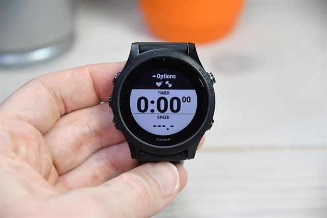
Garmin has for its running app a view and there it drops an overlay with battery info/footpod searching, GPS status and some other options. I want to have the same, but... I have NO clue where I need to look for the thing or what it is called. So I don't know which API I need to look into and play with it. Does anyone have some pointers to where I need to look?

As seen here on the dcrainmaker site: media.dcrainmaker.com/.../DSC_3698.jpg

2) Garmin has a Menu2 thing that once you get to "Add" it blows up and becomes green and says "Add +" or "+ Add". I want that as well. But how? What option in Menu2 is this? 

Taken from: www.dcrainmaker.com/.../quick-how-to-garmin-wearable-heart-rate-broadcasting-to-apps.html

  • Attach any image, you describe something and only you know what is it about.

  • I think that might be the answer to my 2nd question.

  • I'm not sure if CustomMenu is sufficient to implement 2), as:

    - you can't dynamically change the height of the focused item, you can only change its height at menu init time

    - you can't change the height of the focused item at all for touchscreen devices

    1) I do not know where to start looking in the API for the thing I want, because I'm not sure how/what it is called.

    Garmin has for its running app a view and there it drops an overlay with battery info/footpod searching, GPS status and some other options. I want to have the same, but... I have NO clue where I need to look for the thing or what it is called. So I don't know which API I need to look into and play with it. Does anyone have some pointers to where I need to look?

    As seen here on the dcrainmaker site: media.dcrainmaker.com/.../DSC_3698.jpg

    TL;DR that's a UI element that only really exists in certain generations of watches, I don't think it's standard, and I'm pretty sure there's no corresponding Connect IQ UI element.

    If you want to implement it in your device app, then it will only be familiar to users of that generation of watches, and you'll have to implement it form scratch afaik.

    It looks like a Forerunner 945, from this post:

    https://www.dcrainmaker.com/2020/04/quick-how-to-garmin-wearable-heart-rate-broadcasting-to-apps.html

    For context:

    - 935 has a similar, but not identical, overlay. It stays on the screen until you start your activity (I'm guessing the 945 version is like this too.)

    - Newer watches like 945 LTE (and afaik 255, 955, Fenix 7) don't even have this UI element. Instead they have a dedicated activity start page which goes away once you start the activity. The big difference here is there's no overlay to obscure fields on other data pages.

    e.g.

    https://media.dcrainmaker.com/images/2021/06/DSC_5097.jpg

    - Older watches, like 235, didn't have either of those concepts IIRC. (I think it had the GPS/sensor information on the activity selection screen)

    -  It don't see any reference to the 945 type of overlay in the User Experience Guidelines, which is another reason that I doubt it will ever be a standard part of CIQ (especially since it's been abandoned in newer watches.

    - Anecdotally I will say that the 935/945 style of overlay was annoying to some users because it always obscured the top part of their data pages. So if they had a full-screen Connect IQ data field app which always had the clock or some other useful information at the top of the page (for example), they would never be able to see that information until they started the activity. Of course since you would have full control of your own device app, that might not be an issue for you.

  • My Fenix 6 has these overlays as well on almost every stock app. They have black or white backgrounds. There is also an overlay with a menu on the F6 which comes from the side.

    The cool thing about these overlays is that you see the view but still tell the user: you can do action x/y/z.

  • My Fenix 6 has these overlays as well on almost every stock app.

    Sure, Fenix 6 and 945 are pretty similar in UI and functionality afaik. Just like Fenix 7 and 955. Just saying that newer watches don't seem to have them -- at least not the persistent overlay with the sensors which only goes away once you start the activity. I do see the same kind of overlay with a black background, as a temporary notification when a sensor is connected. So the "top overlay" concept is still there.

    Anyway, there's no CIQ UI element for them, so you'd have to implement them yourself.

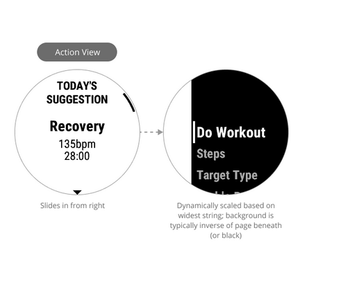
    There is also an overlay with a menu on the F6 which comes from the side.

    The cool thing about these overlays is that you see the view but still tell the user: you can do action x/y/z.

    Garmin calls this an action view, and it's also not in CIQ.

    On my 945 LTE, one place that I see this in the strength activity when you press START after the activity has started.

    I have mixed feelings about it -- it looks nicer and is less intrusive then the normal pause menu, but it also means that you have to press START twice to pause a strength activity, unlike most other activities.

    [https://developer.garmin.com/connect-iq/user-experience-guidelines/forerunner-2018/]

  • Yes, their Strength app is weird in that respect. The running app just starts when you press play. I filed something via a feedback form somwhere on the Garmin site. But I doubt it enters the e-mail box/direct/asynchronous communication channel of their PO.

    Regardless of the UI things of the strength app, I do like those overlays that they have. It's much more friendly than the Menu2. Less.. bulky. I mean, I love Menu2. Although on the Fenix7 on the sim I think it looks horrible... But I like Menu2 for all other watches I have. But these new menu style things are pretty sweet UI wise.

    But I hate developing UI stuff because it is hard to automate the testing. 

  • Yeah the new menus are nice -- def more lightweight -- but the implementation in the strength app sucks. It would be nice to have a consistent experience across activities. I'm guessing they will move towards that in the future.

    I find it's a common theme -- there's a lot of stuff that seems great in theory, but has issues in practice. Like the touchscreen for Epix 2 / Fenix 7 / 955. Lots of people said "whoa this will be great for maps", but in practice there's complaints:

    - the touchscreen can't be set to be enabled only for the map page, which causes problems with accidental touches in other contexts. (e.g. It's raining and your activity automatically gets saved or discarded -- this is a problem that people have complained about with basically every Garmin touchscreen watch, although to be fair I see a few similar complaints for runners who use Apple Watch). So people work around this by setting a hotkey to toggle the touchscreen, so they can manually turn it on for maps and off for everything else. It's nice to have options like this, but not so great if you're forced to rely on them to have a decent experience.

    - For whatever reason, the map touchscreen functionality for 955 is reduced compared to Fenix 7 and Epix 2, although I guess this *could* be fixed in the future, if Garmin wants to.

  • so resign from autotesting :-)