Manually exit a widget (or simulate a keyevent)?

I made a widget showing a list of stats, because for new watches the list can be long it can be spread over 2 pages (and pressing/swiping up and down switches between the two by simply different drawing in onUpdate)

But one issue was that up/down buttons only work in glance enabled widgets (otherwise it will toggle between widgets) whcih I worked around by pushing a dummy view and immediately pushing the main view.

However, now when pressing back from the main view I get back in the dummy view and you have to press back once more to actually get out of the widget. Is there a way to do this automatically?

System.exit() and popView don't work... the first doesn't do anything it seems and the second isn't allowed.

Is there a way to emulate the back button press or a key event programmatically perhaps?

Top Replies

All Replies

  • I'm really not sure how having the screen switch automatically every X seconds could be considered a "2nd interaction model".  As I've said, not one single complaint in 7 years!

  • I'm really not sure how having the screen switch automatically every X seconds could be considered a "2nd interaction model".  As I've said, not one single complaint in 7 years!

    I was referring to this part specifically:

    I then use onSelect() to toggle the screens

    It's simple.

    I'll say it again. Especially on older watches, native widgets usually work like this:

    1) Top-level view shows info. Press START to open 2nd-level view

    2) 2nd level view might show same or similar info, but now you can press UP/DOWN to switch between pages

    In some cases, there is a secondary (not primary) navigation which utilizes START, but you're always navigating through a different set of screens in that case.

    I've seen CIQ widgets which do as you describe, where there is a single view, and you just press START to flip views.. There's even a "page indicator" which looks very similar to the native page indicator, which suggests that pages are "arranged vertically". It's a series of vertical dots, where the dot representing the current page is filled in and the others are hollow.

    If I were to take that indicator literally, I would expect to be able to press UP/DOWN to switch pages, but of course I can't. Of course the problem here is that on old watches, if I do press UP or DOWN, it'll switch widgets instead of switching pages, since there's only one view. At least on new watches with glances, I'm in the "full widget view", so pressing UP or DOWN does nothing. At the very least, this kind of widget should have an indicator next to the START button for multiple pages, much like the newer Garmin widgets which have two modes of flipping (UP/DOWN) and START which flip different "dimensions" of the widget. (Like the VO2Max widget where UP/DOWN flips between Vo2, Race Predictor and LT, and START flips between Running and Cycling VO2Max)

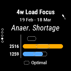
    1) Garmin native widget with page indicator (pages are navigated using UP/DOWN).

    There's also the secondary navigation indicated by the UI element next to the START button in the upper-right hand corner. (But again, START navigates through a different set of pages than UP/DOWN, and this is clearly indicated by the UI elements.)

    Note how the vertical dots suggest that pages are laid out vertically, and that pressing UP/DOWN would naturally scroll through them. That's what I learned by using Garmin watches, anyway.

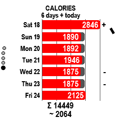
    2) 3rd party widget with page indicator (pages are navigated using START)

    Here we have vertical dots again, but pressing UP/DOWN either exits the widget or does nothing, depending on whether I'm on an old watch or new watch. Sure, there's a UI element next to the START button, but it counter-intuitively takes me through the vertical list. (It's counter-intuitive once you've learned how Garmin watches with buttons work, anyway)

    If you don't agree that those are two fundamentally different ways of interacting with multi-page widgets, guess we'll just have to agree to disagree. I mean you literally said "I don't use UP/DOWN, I use START", but it's hard to to argue that Garmin doesn't use UP/DOWN....

    As I've said, not one single complaint in 7 years!

    Thumbsup

    I wouldn't complain either, if I got a nice functional app that I like for free. I didn't complain to the author of the 3rd party widget above either, since I got it for free and I like the functionality.

    That doesn't mean I don't find it jarring whenever I use the widget since it works differently than all other widgets on my watch. It was literally the first thing I noticed. It was something new and different I had to learn and every time I use that widget, it's something I have to keep in mind.

    Once again, my point is that it's inconsistent. If you wonder why I mentioned that, it's because:

    1) OP said: I want to implement scrolling through pages using UP/DOWN

    2) You said: I don't do that I use START

    3) I said: but native widgets use UP/DOWN, so this pattern will be more familiar to users

    Simple as that. It's very similar to how people often complain when they use cross-platform software that breaks the normal UI conventions of their PC or Mac.

    As a more extreme example, I have a data field which has a really weird way of scrolling through "pages" (since real interaction isn't possible with a data field, outside of the on-device settings view, which ofc isn't available for older watches.). I cringe every time I have to explain how it works. The only reason I did it was because there were no good options for interaction at the time.

  • This is far less of an impact that apps that try to detect their own long presses, double taps, etc  Having things be different if the watch has glances or not, is on that same level to me.

  • This is far less of an impact that apps that try to detect their own long presses, double taps, etc  Having things be different if the watch has glances or not, is on that same level to me.

    Sure but the consistency problem I mentioned predates glances.

    And it's pretty easy to detect if a widget was launched via glance or not. (Just check DeviceSettings.isGlanceModeEnabled.) I assume Garmin put that in the API for a reason.

    If Garmin wants us to at least attempt to deliver a consistent (*) user experience to the end user (which is what they seem to be hinting at with the device personalities and UX Style Guide), then we have little choice but to take into account whether a widget was launched in glance mode or not.

    (* i.e. consistent, as in a CIQ widget which acts similarly to a native widget on the same kind of device.)

    Seems to me like consistent UX only benefits Garmin.

  • glance view and full view are separatedn classed and of course 2 onUpdates. So in glance start timer and update it every 2/3/4... seconds showing different values. In full view you can do the same or waiting for button/touch scroll.

    You can also draw scrolling text. There is a few solutions.

  • Sure, the simplest thing is not use something in general hehe... But that's not what I want(ed). Problem is the single screen can get quite full/cluttered and wanted to give the user the option to split them in 2 logical sections.

    Also, apart from up/down I use start to show some history info (which then uses up/down again to go through screens).

    Guess a workaround would be using start and back to toggle between the 2 screens (not quite intuitive though) and go to the history part when pressing start one of the 2 specific views. Not really nice/intuitive imo though.

  • Guess a workaround would be using start and back to toggle between the 2 screens (not quite intuitive though)

    But that's how Garmin widgets work, right? On older non-glance watches, they distinguish between the top-level view and 2nd level view by inverting the colors. Top-level is white on black and 2nd-level is black on white. On newer glance watches, the background is always black (since it's obvious when you're looking at glances versus "full view").

    Lots of people say the Garmin UI itself is unintuitive (and they're right -- you have to learn it), but once the user learns it, it wouldn't hurt if a 3rd party app works in the same (or similar) way.

    For example, when they're on the second screen, if you don't want to invert the colors (most CIQ widget devs don't, including me), you could show vertical dots to indicate that scrolling is available.

    Or you could just bite the bullet and use START to cycle through screens, as Jim suggested. I have at least one CIQ widget which does it (screenshotted above). It has 200k downloads and 426 reviews (average 4.8) on the store, so it's very popular. https://apps.garmin.com/en-US/apps/222eb4ce-8387-49c3-9560-1334ce1aebe4

    Of course, for newer glance mode watches, even this widget unavoidably has two modes. You have to press START to enter the full view (at which point you can use START to toggle views), but you obviously still have to press BACK to return to the glance list. In older watches, navigating widget has less friction, since there's only one view/mode to deal with (you don't have to press START to "open" the widget, and BACK to "exit" it).

    Not really nice/intuitive

    I actually think it's less intuitive to do what you proposed. If I understand correctly, on a non-glance watch, you want to:

    1) Have a top level view where pressing START takes the user into the 2nd level view which is scrollable via UP/DOWN

    2) But pressing BACK on the 2nd level view should exit the widget completely (e.g. go back to watchface?)

    The problem here (IMO) is that no Garmin widget works like this. And what if the user actually wanted to go back to the top level view, so that they could get back to their previous place in the widget loop?

    IMO, whenever pressing START opens a new view (as opposed to toggling between views, which is a subtle difference), pressing BACK should return to the previous view. This does get confusing when you have the Garmin widgets where START simply toggles views. That in itself is sort of inconsistent.

    Having said all of that, I wish you could programmatically pop the top-level full view in *glance mode* only. That would give glance widgets parity with with non-glance widgets. The top-level full view for a glance widget is conceptually similar to the 2nd-level view for a non-glance widget (both of them are accessed by scrolling to the widget and pressing START), and of course it's always possible to pop the 2nd-level view.

  • device usage for beta firmware run this way on f6p, I've reported it as bug :-)

    you can see something on black background, you have to press start and b white background then you can press up/down to see other pages - I've found it f7 accident-it means not logical for user (f6p is my first watch)

    I use up/down and start as up. 

    Garmin doesn't keep its standard - let's see health widget on f6p - there is no loop i items. So the most important are users if they can discover easy how to use you app - is enough

  • you can see something on black background, you have to press start and b white background then you can press up/down to see other pages - I've found it f7 accident-it means not logical for user (f6p is my first watch)

    I don't think that makes sense on a glance-enabled watch for sure. If I'm understanding you right, even after you open the glance (by pressing START), you have to press START *again* to be able to navigate pages?

    Sounds like a widget that was ported from an old watch like 935 or Fenix 5 which doesn't have glances. The newer watches with glances also don't do the white background thing (since the difference between the glance view and the full view is quite obvious.)

    Garmin doesn't keep its standard

    Yep that's Garmin. The Strength app for newer watches opens a cool popover menu when you press START, but that also means you have to press START *twice* to pause the activity as opposed to every other activity where you just press START once.

    So the most important are users if they can discover easy how to use you app - is enough

    Fair enough. Like I said, the widget I used as an example (Weekly Activity) has 200k downloads and 426 reviews (4.8 / 5 average), so it's pretty popular. Users don't care that it's inconsistent. Maybe they like it better idk.

    I still think there's nothing wrong with behaving like Garmin's built-in widgets. Especially with glances, you have no choice (you have to press START to open a glance widget in order to get a full screen view.). So once you've pressed START to get to the full view, I don't see a problem with using UP and DOWN to navigate pages, just like every menu or activity on the watch.

  • Basically how it's done now is as follows (in case of user deciding to split the main view in 2 pages, otherwise there is no issue)

    * Glance: Glance <--select/back--> Main View 1 <--up/down--> Main View 2  (From any main view <--select/back--> History Views (up/down)

    * Non-glance: Main View 1 <--select/back--> Main View 2 <--select/back--> History Views (up/down)

    With the dummy it was:

    * Non-glance: Dummy --immediately push/back--> Main View 1 <--up/down--> Main View 2  (From any main view <--select/back--> History Views (up/down)

    And then when exiting the widget ppl had to confirm exit on the dummy view. Still not decided what the nicer way is for the non-glance mode ;)