


Hello.
I'm developing a widget.
From the main view, when user presses MENU I trigger a confirmation delegate that shows the message: 'Reset data?' and shows the 2 basic options 'Cancel' and 'Confirm'.
Everything works as expected: if the user presses back, he is brought back to the main view. If he presses MENU data is reset and he is brought back to the main view.
The issue is the layout of the confirmation dialog. It shows the question on the upper third of the screen,centered. Then the options (cancel confirm) in the lower third, with cancel on the left and confirm on the right. Something like this:
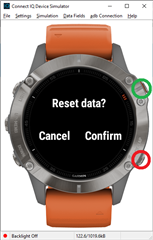
Considering that target devices have buttons (Quatix 6 series) and that MENU and BACK buttons are placed on the right side both, up and down.... that is not very intuitive.
In the image the green and red circles represent the buttons to be pressed (for those not familiar with the device).
Is there a way to change the view/layout of the confirmation dialog?
Thanks in advance!