Background
AMOLED devices such as the Venu and Epix 2 have a restriction on the duration that pixels can be turned on while in low power mode. In particular, no pixel can be on for more than 3 minutes, and no more than 10% of all pixels can be on simultaneously.
A simple strategy for dealing with this is to use a checkerboard bitmap mask pattern that alternates each time the screen is refreshed (once per minute). The mask is overlaid on top of the screen image, blanking out some pixels while leaving others visible. By inverting the checkerboard each refresh, it prevents any one pixel from being on too long, and can also reduce the total number of pixels.
A checkerboard mask pattern does the trick, but it's not necessarily optimal. For example, a checkerboard blanks out 50% of pixels on a given frame, hence reducing the image brightness by 50%. This is more than necessary to meet Garmin's pixel requirements. So can you do better?
An alternative that's nearly as simple is to use the diagonal mask pattern shown here:
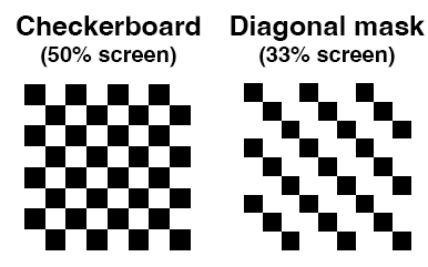
This version only blanks out 1/3 of pixels, so the resulting image is brighter than a checkerboard. But it requires that you use a sequence of three masks, or alternatively shift a single diagonal mask one pixel to the right on each refresh (and figure out a way to blank out those first 3 columns of the screen). Either way, after three screen refreshes (at once per minute), no one pixel is turned on for three minutes.
However, the diagonal mask adds diagonal stripes to whatever you are drawing, in a way that the checkerboard pattern does not. This got me thinking,
What is the "optimal" mask pattern?
I had the idea that randomly generated masks might work better. My reasoning is that (because they are random) they would avoid the artifacts from the diagonal mask. The first challenge is generating a set of three random masks, such that if you stacked them on top of each other, they would completely blank out the image. I wrote some code (in R) that accomplishes this, and it turns out to be not so difficult.
But random masks look horrible! The problem is that "chance is lumpy"... the randomly generated masks look very blotchy.
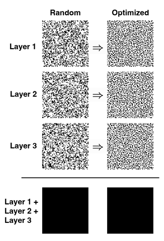
My next idea was to try and "optimize" a random mask pattern. The approach I used was this: Start with a set of three 72x72 pixel masks that satisfy the constraint on blocking out pixels, and then randomly transpose two pixels within an image (and transposing the same two pixels in each mask layer), and evaluate if the new versions were any better. This requires defining what makes a mask pattern "better".
My approach was to minimize the variance in the intensity of the image. A checkerboard achieves this, because it has uniform density. Random patterns on the other hand are too splotchy, so some image patches are bright and others are darker. So I computed the average image intensity in a 3x3 neighborhood around each pixel, and then computed the variance in this image intensity across the entire image (repeating this for each layer of the mask). If the randomly transposed versions were an improvement in terms of lower variance, they became the new starting point. Then the process was repeated, thousands of times. (This is a stochastic hill-climbing algorithm.) The result is a set of random masks that have more uniform pixel density, but still satisfy the basic constraint that the three masks stacked would perfectly blank out every pixel.
Here is what that looks like:
So does it work?
Well, sort of. Not nearly as well as I hoped, but judge for yourself:

Notice that both the diagonal, and optimized masks are brighter than the checkerboard. That's a good thing. However, the legibility of the optimized random mask is arguably worse than the diagonal mask. It adds kind of an artistic effect that might be useful in some cases, but all around if I had to choose I would probably stick with a simple diagonal mask.
Conclusion
I spent way too many hours on this experiment, and so I'm posting it here as a record of my efforts in the hopes that this is useful. Or perhaps others might be inspired by the idea and come up with a better definition of an "optimal" mask.