How to change the Picker Class User Interface?

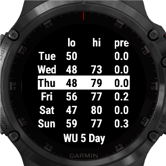
I am working on an app that has a timer in it. To choose the time I was hoping to use the picker that is already in use on the watch e.g. setting alarms. The documentation states that the NumberPicker class will be dropped so I am using the Picker class. My final product for the picker (a TimePicker class from Ui.Picker and a NumberFactory class from Ui.PickerFactory) gets the job done, but doesn't look very good. It looks completely different from the native picker, and I can't find a way to change it. The documentation seems pretty unsubstantial on pickers and doesn't really help. I have searched this forum too and haven't found anything useful. I know its possible, I have seen apps on the store that make use of this picker. I might just create my own from scratch, but i would like to use the native one, since it is possible. i have included a picture of the default Picker Ui that I have not been able to change.

Thanks,
Griffin
  • You really have very little control over the layout of the elements in the picker; the title, next, previous, and confirm drawables will always appear in consistent locations. The only thing you have control over is how the picked values are grouped, and how each of the elements are visually displayed within their pre-defined layout area. You can use any class that inherits from Ui.Drawable to represent the title, next/previous arrows, confirm button, and the values, and you can use attributes of those classes to control how they are displayed. If you use a Ui.Text, you can align the text to the side, control the font, and text color, but that is all of the control that you get.

    I'm guessing that if you see apps in the store that use a picker that looks 'better', that is because they are relying on the deprecated NumberPicker, and those apps will not work with future device firmware versions.

    What is it about the picker that you are trying to change? What are you trying to make it look like?

    Travis
  • Thanks for the response Travis. I had the suspicion they were using Number Picker. I was kind of sick of dealing with the Picker class too, so I created my own "picker" derived from Ui.View. The UI looks a lot cleaner in respect to the Picker class, mainly with the removal of the boxes. Thanks anyways.
  • Any chance you could share your code on the picker? I am using the Ui.PickerFactory to let the user select from a list of strings, but a lot of the data is concatenated this way. It would be nice to be able to use the whole screen width to display the string.
  • Hi,

    I just finished my first garmin fenix watch app to help with my training. I was targeting Fenix 6x pro only. I also used picker and came to the same issues. Seems like having all those controls which are available is a must to have a consistent and goog looking UI. I agree we can do the same using Drawables, Views and Delegates but why should we reimplement the same? How when reimplementing have the same UX if you find yourself targeting an wider audience?

    I come from C#, .NET and I would be very disapointed if I would be forced to reimplement any Windows control to do my work :) Anyway having this SDK is very usefull apart from its issues. Some other companies do not have any and we cannot do anytging for ourselves if we need to.

    Does anyone know why does Garmin not release those native controls in its SDK? Or maybe I did not look close enough and its there just not documented?

  • With the NumberPicker and TextPicker, native stuff was used, but with the va and venu devices, there isn't a native TextPicker.  On other devices, they aren't generic from device to device.  Menu is kind of generic, but doesn't look like the devices in the sim, while Menu2 looks the same across devices, but differs from the native device menus on some devices.  Then there are things like touch vs buttons.  There are also cases where there isn't really a native equivalent.  Here I just did my own from scratch.