How to anti-alias an icon?

Like this thread https://forums.garmin.com/developer/connect-iq/f/discussion/209210/tuto-or-code-to-make-an-anti-aliasing-watchface/982204#982204

But a little different, I want to anti-alias an icon.

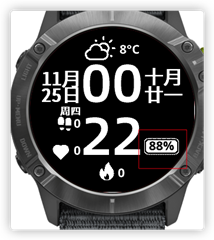
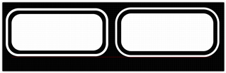
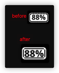
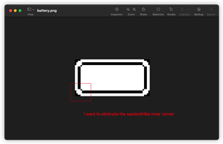
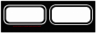
In two pics, fr945 and enduro, the battery icon displayed quite differently, the border for enduro was not smooth, like sawtooth. I used sketch to scale up 280/240(ie. 1.17x) the icon from that for fr945. What caused this issue,sketch export mechnism or garmin devices difference?

Top Replies

All Replies

  • I do my icons with a custom font and just anti-alias that way.

  • What caused this issue,sketch export mechnism or garmin devices difference?

    Depending on what kind of scaling algorithm was used, you could've introduced additional colors in the image which aren't supported by the device, which could look weird whether or not dithering is enabled for the bitmap resource, since most Garmin devices (except for Venu) have a very limited color palette.

    You could verify this for yourself by opening the scaled bitmap in an editor and using the color picker to see if it has more colors than the original (and you could double-check to see whether these are colors supported by the Garmin devices you are targetting).

    From a quick search, it seems that Sketch scales in a way that introduces new colors (through interpolation).

    What you could do in this case is use nearest-neighbor scaling, which gives you a more pixellated result, but preserves the existing colors. This doesn't seem to be supported by Sketch, but you can use GIMP:

    https://docs.gimp.org/2.10/en/gimp-image-scale.html

    docs.gimp.org/.../gimp-tools-transform.html

    (Select "none" for the interpolation type.)

    You could also just try disabling dithering on the scaled bitmap resource: developer.garmin.com/.../

    For anyone reading this who uses Windows, I also like to use Paint.NET for this kind of thing.

  • Ok. I dislike using bmfont although it great cuz I have to open my windows pc. Making pngs with different resolutions is much easier for me.

  • I tried gimp,it works. 

    From a quick search, it seems that Sketch scales in a way that introduces new colors (through interpolation).

    Can you tell me the source, I wonder the interpolation algorithm

  • I searched this:

    [https://www.google.ca/search?q=sketch+app+nearest+neighbor+scaling]

    and found this:

    https://www.designernews.co/stories/46007-ask-can-sketch-be-used-for-pixel-art-

    don’t believe anti-aliasing can be disabled in Sketch.

    I think the main features you're probably after for pixel art are:

    1. Being able to paint with a non-antialiased pencil or brush.
    2. Nearest neighbour scaling (keep blocky things blocky when you scale).


    It doesn’t say what kind of scaling is used but I’m guessing it’s some form of interpolated/anti-aliased scaling. 

  • Nice! You might want to touch up some of those pixels by hand. The corners of the inner black rectangle look a little thin. 

  • interpolated/anti-aliased scaling.

    The procedures in sketch and gimp are not equivalent. 

    In sketch, I used CMD+K to scale my vector icon and then export it to a png, I think the interpolation was performed when the image was exported.

    And GIMP use it when scaling up.

  • Yeah, if you used non-interpolated scaling in GIMP, it's not surprising that you'd get a sawtooth corner like that. That's the trade-off for not using interpolation. The problem with interpolation / anti-aliasing is it uses intermediate colors to fill in the gaps smoothly, so that will cause problems on devices with a limited palette.

    That's why I suggested fixing the inner corners by hand.

  • HI, I was told a concept Pixel Alignment today. If anyone sees this thread in the future, you can check your vector icon in sketch or figma or inkscape or any other vector editor.

    The left one is not aligned and the right is aligned.

    If pressing Option+P, your will find the output is like below, which  is just the export effect.

    The interpolation algorithm will be invoked when the vector is being exported. Finally, the output image will contains weird gray color. (only white and black is expected actually)

    I checked the color palette for Enduro, gray is absent, in which case the nearest color——white will be used to substitude it. Aha, that is why I got a sawtooth-like icon effect.