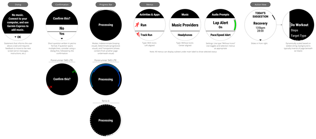
sample apps of existing ui functionality

With the user experience guide being more important with the presentation today, is there any plans of developing some of the built-in apps of various types as monkey c apps to demonstrate the best way to render the UI in a clean way that follows the correct garmin style?  (especially an example of the more complex ones like the graphical data fields)  Would make it easier to get developers started and to follow the right look on all devices.  

  • There are the samples in the SDK samples folder that shows a number of things.  Also, there's a sticky here with a link to PeterD's site where there is a bunch of sample code.

  • I'm more focusing on the UX that was discussed today. The samples only do very simple UI and the sample code doesn't really cover the advanced UI that is similar to what Garmin wants. For example the graphical data fields on the edge unit. Or the chart like functionality that goes around the outside edge of the round screen wearables.

    Garmin wants a more consistent ux for end users but developers are supposed to implement their own functionality from very primative graphics functions. This leads to basic UI  or developers who do or forth the effort to do advanced graphics to not be so consistent

  • I agree 100%. Something like the action view on newer Forerunners looks nice (although I don't have it because my watch is a bit older), but does Garmin really expect devs to reinvent the wheel?

    Then again, what are we supposed to do for older Forerunners which wouldn't have a native action view? Reimplement it anyway? Or try to mimic the "native" experience of older devices. (I'm gonna guess Garmin doesn't care so much about what we do on old devices tho)

    Not to mention the fact that even "current-gen" devices like 245 (non-music) don't exactly have a lot of memory to spare, for implementing nice UI elements.

  • Lots of things should be generic code:

    The dialog and confirmation should just be like a messagebox in windows programming (I'm assuming other OSes have the same general think) where you pass in the text to display and a parameter of the options the user can pick from (ok only, yes/no, etc) and it returns the option the user picked.  The sizing to fit in the screen and the device-specific rendering like the 945LTE in the above image should be something the developer doesn't need to deal with.

    The progress bar should really be looked at as a border chart control.  Have parameters if it should be conitunous looping (the progress bar), IF there is a min and max of the chart, if the chart has zones (like HR), if there should be a visual indicator to the current value.  The developer shouldn't need to care what the current resolution of the screen is or how to draw it.  

    Menu?  Pass in a menu header and the list of elements in the menu.

    Why does everyone have to reinvent them?  Reusing an existing controls makes it easy to keep the same UX as the rest of the garmin.  Sure, old devices may have issues cause they are too limited, but newer devices will be easier to develop for.  If Garmin could get connect iq to call the native functions to do the heavy lifting, even better

  • Menu and Menu2, along with the progress and confirmation, MapView, MapTrackView are native views already.

    For some other things, I got the impression that the CIQ might add some other things to help (I was thinking using barrels).

  • HI, FS,

    Where did you find these showcase or intro

  • How can i reproduce the Forerunner confirm dialog, or is it the device specific representation? It looks like the fenix 6 running activity save dialog.

  • AFAIK, the sdk version on sim is different from that on a forerunner device like 245 etc. So the effect of Confirmation Dialog is different, you need check it on a real device.

  • Yes i know, but on the real Fenix 6x pro (actual firmware) the confirmation dialog looks like the first example with the menu like design