
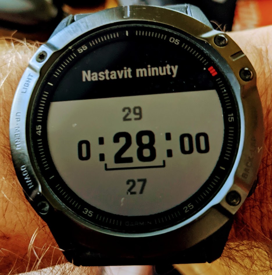
Hi, I'm implementing custom picker but I found that it looks differently than picker eg in timer app (on my Fenix 6X).
Timer app picker looks nice (has white background, black top with title)
but my picker looks extremely boring and unintuitive.
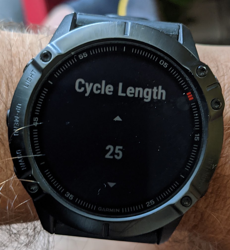
Can I somehow customize it to achieve the same look like system apps do have?
Thanks for help
Tom


