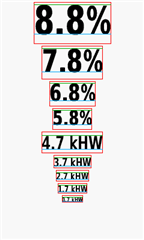
As many of you know system fonts may differ between a simulator and device and the reason why was explained in the following thread:
https://forums.garmin.com/developer/connect-iq/f/discussion/6234/drawtext-positioning-differences-between-edge520-device-and-simulator
That is very unfortunate for us developers as we don't own or have access to all Garmin devices to test, so we have to choose between these options:
- Release the CIQ application only for devices that we own
- Align fonts on the simulator and hope that it would look good enough on a real device
- Use custom fonts
Every of the above option has its own drawbacks, so I would like to propose a fourth one. Based on the tests that I've done in the past, in order to vertically align a text the same in a simulator and a real device we need to have the top padding for each system font, which is the green line in the below picture:

The blue line (font baseline) can be retrieved by using getFontDescent method, which is very accurate on simulators and my Edge 1000. Please correct me if I am wrong as my testing is based on only one real device. In my CIQ applications I used the green and blue line to vertically align text, which you can check the source code if interested:
https://github.com/maca88/E-Bike-Edge-MultiField
https://github.com/maca88/SmartBikeLights
The problem of this approach is that it requires the top paddings of each screen-resolution family (e.g. round-260x260) and each language that has a different font (English, Chinese, Vietnamese, Japanese, Korean, Thai). So for anyone that is interested and would like to contribute the values of real devices you can do the following:
1. Download the project: https://github.com/maca88/E-Bike-Edge-MultiField/tree/master/Source/FontPaddingTest
2. In the folder resources-[screen]-[resolution] of your device add jsonData resource "DeviceFontPaddings", with the language that you want to contribute (e.g. english: <jsonData id="DeviceFontPaddings">{ "EN": [0, 0, 0, 0, 0, 0, 0, 0, 0] }</jsonData>). The "DeviceFontPaddings" array values represents the top font paddings for each font (the first value in the array is the top padding for FONT_XTINY, second for FONT_TINY, ...)
3. Compile the application and run it on your device
4. Modify "DeviceFontPaddings" array values until the green lines are touching the top of the fonts like in the above picture
5. Post the results here or on GitHub
Currently the only real device paddings are for Edge 1000, which you can check here (the biggest differences are for the first five fonts):
https://github.com/maca88/E-Bike-Edge-MultiField/blob/master/Source/FontPaddingTest/resources-rectangle-240x400/data.xml
In my short experience with developing CIQ applications the biggest struggle for me was the text alignment, which took me way more time that it should and that is also my reasoning for creating this thread. It would be great to have one place where we could see the font differences so that we could use them when needed. Let me know your thoughts on this, thanks.


