Checkbox settings and colour configuration

Hello,

I'm currently working on an app using menus and checkboxes.  The checkbox label and contents are to be stored in the settings, so the user enters what they need in the settings menu.  I am experiencing a few issues, the solutions which I could not find in the Programmer's Guide or in the forums and hoping to get some advice here.

1.  I set a default value for each menu title as a string, but I can't seem to get it to show up in the settings menu; it shows up blank on the device and the settings menu until the user types their custom title in.  Ideally it should display "List 1" as default until the user does their own thing, based on this code below.  What am I missing?

<property id="ListName01" type="string">List 1</property>

<setting propertyKey="@Properties.ListName01" title="@Strings.ListName01Title">
<settingConfig type="alphaNumeric"/>
</setting>

2.  After the user adds their settings, the display does not automatically update unless they go back to the home screen then to the menu list again.  I've added the onSettingsChanged function in the app.mc file with a message log enclosed.  I see the message in the log whenever the settings are changed, but the menu list or checkbox won't change dynamically while looking at them.

function onSettingsChanged() {
WatchUi.requestUpdate();
System.println("Settings changed!");
}

3.  Is it possible to change the colours of the menu list and checkbox from black on white?

Thanks in advance.

  • Np. You need to call updateItem() outside of onMenu() somehow. onMenu() is only called when the user presses the menu button.

    For example, you could call updateItem() in onSettingsChanged(). Similarly, if your menu labels/contents change somehow based on user input, you can call updateItem() in the menu input delegate.

  • So what you are trying to do is update a menu on the device, while it's showing, by changing app settings from a phone.  Is that correct?

  • Yes, that's exactly correct.  The user should be able to compile their own list on the phone settings menu by choosing a label and items under each list (like a to-do list which can then be crossed out when they are done with it).

  • Right, so when updateSettings() is called, you would have to run your own code which add, deletes, and updates menu items as necessary. (For the best possible user experience.)

    Regarding changing the appearance/color of the menu, you would have to use CustomMenu and CustomMenuItem, I think, which means that you would have to render your own menu items and forgo the CheckboxMenuItem class that you wanted to use. (This does mean you would lose the device-specific appearance of checkboxes.)

  • The easier way to do it might be to have a static menu which is programmatically popped and recreated when settings change, but that might be visually jarring.

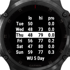
  • You may find it's easier to just not use a menu.  What it sounds like you have is a list, where the user selects something and then acts on it.  Here's one of my apps, where I build the list based on a makeWebRequest, then using up/down (or swipes) highlights an item, and when the user selects an item, it displays info for that item (no reason that part couldn't be a menu). or that the main list isn't generated with onSettingsChanged.

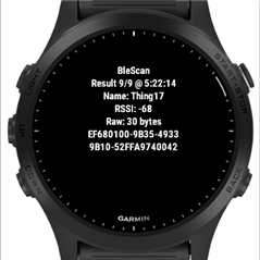
    Another option I use is to have a screen per item.  Here's another app where I scan for BLE devices, and the number can grow (again, could be based on onSettingsChanged.

    The "Result 9/9" indicates I'm on the 9th item out of 9, where again, up/down cycles through, and select displays aditional info.

    Neither of these was complex to do, and allows you to use whatever colors/decorations you want, and you aren't limited to devices with Menu2.

  • Those are great suggestions.

    Or if you still want something that "looks" like a Menu on old devices, you can use DMenu for CIQ < 3 and Menu2 for CIQ 3. (To be fair, the UX isn't perfect.)

  • In the case of the WU forecast app, using menus of any sort take up too much if the screen.  This way I can show all 5 days on a single screen and dig deeper if needed.  For the blescan, each item has too much to display using a menu and can easily show more data using select.

    Depending on the app, a menu can just get in the way. And in this case, not using a menu can simplify things when it comes to app settings, colors/decorations, support of more devices, etc

  • Yes, I want to create custom todo lists that users configure to their needs, which a user taps or swipes through then cross on or off where needed.  I first attempted to set up the lists in the form of an array in which the units are rearranged based on the user action giving the illusion of scrolling up/down, but I've found CIQ to be very limited in that aspect when it comes to arrays so that did not work out.

    Your first image looks similar to the functionality I want (but the Menu2 checkbox looks nicer!).  Still trying to decide the best way forward.

  • I agree that if I can use one method across the board, it will be easier to control the look, functionality and support for many devices.  In my mind, a user can create a todo list, add the list in the settings menu and it appears on their devices, where they can use the touchscreen or buttons to navigate up and down.  Tap or enter to toggle between crossing them out of the list (by check or grey out or cross) or adding them back again.  The problem then becomes how to present it in such a way to be clear and accessible to users.