Values returned by dc.getTextDimensions(text, font) do not fit the text?

Hi all,

I've been looking for a while on internet and this forum, but couldn't find an answer. So I decided to post my question. I hope I didn't duplicate a question with my post.

I'd like to use the dimensions of a text as reference to drawmy objects on a watchface. Unfortunately, the methods dc.getTextDimensions(text, font) and dc.getFontHeight(font) return strange values. Or maybe the rendering of the text is wrong? In any case, here is a small example of my problem:

function onUpdate(dc) {
    	dc.setColor(Gfx.COLOR_BLACK, Gfx.COLOR_BLACK);
    	dc.clear();      
		
		var text = "1136";
		var x=50;
		var y=50;
		var font = Gfx.FONT_SYSTEM_NUMBER_HOT;
		dc.setColor(Gfx.COLOR_WHITE,Gfx.COLOR_BLACK);
		dc.drawText(x,y, font, text, Gfx.TEXT_JUSTIFY_LEFT);
		
		var dim = dc.getTextDimensions(text, font);
		var h = dc.getFontHeight(font);
		System.println(dim + "  >  "+ h);
		
		dc.setColor(Gfx.COLOR_RED,Gfx.COLOR_RED);
		dc.fillCircle(x,y,3);
		dc.setColor(Gfx.COLOR_GREEN,Gfx.COLOR_GREEN);
		dc.drawRectangle(x, y, dim[0], dim[1]);
    }

this snippet of code gives

As you can see, there is a margin above and beneath the baseline of the text. Also there is a space between each number.

I have the same problem when following the tutorial https://www.youtube.com/watch?v=PRQyA4BeqqE

I get this result (code is slightly different, but the idea remains the same):

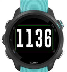
The font has a height of 180px and according to the System.print, the dimension returned by getTextDimension is effectively 180px (see green rectangle); meaning the text is smaller than 180px. How can this happen?

Does anybody have an idea?

Thanks!

Gautier

  • Text dimensions include ascent, descent and kerning.

    That is similar to almost all graphics programs... Flash for example.

    You can, to a limited degree, offset the descent by subtracting getFontDescent() but... honestly... why would you?

    If you get things too tight, then you will not be able to read the text.

  • However...

    I have noticed there is a difference in the simulator for Edge versus watch interpretation of ascent / descent.

    Not got an Edge to compare it in the live environment.

  • Ok, I understand but then it means I can't get the real baseline of the text. Even when subtracting  the descent, I don't get the good value. And as the descent and ascent are not good, I can't center for example my text by just applying 'height/2'; didn't try the VCenter alignment, but I expect the same.

    As you can see in the tutorial, even the space between characters is not the same. I expect a change in the SDK that affects the behaviour... ??? I'd prefer to have methods like setPadding, setMargins, ... to display the characters the way I'd like.

  • If your point is that Garmin watched have poor typography, then yes. 

    They’re engineered for functionality rather than visual impact as far as I can tell. 

    To me, that’s preferable... I was impressed when I moved from FitBit with all that Garmin could offer. 

    Is it pretty? No. 

    Does it offer an astonishing amount from limited hardware? Yes. 

  • The white space above and below is normal, and it does vary by device, and is more visible in number fonts. (you font see it on the fenix 5 for instance)

    When it comes to edge devices, what SDK are you using?

    What you're seeing is 100% normal and has existed back to the original CIQ devices.  The fonts used on devices are those the FW people picked, so things like this aren't up to CIQ.

  • Don't misunderstand me. I love my watch and the incredible features it owns! I would not change it for  another fancier device.

    I'l using the latest SDK (3.1). I still wonder why I don't get the same result as in the tutorial on youtube. Anyway, no worry. Now I know it's not due to me, I'll see how I can achive what I want to do.

    Thanks for your replies!

  • What tutorial on youtube?  I recall one involving custom fonts that  was done years ago, but custom fonts are a whole different thing.

  • Few things I do regarding this.  

    1) I'll get things like font height in onLayout().  It only really needs to be done once, so no need to do it each time onUpdate() is called.

    2) I tend to include Gfx.TEXT_VCENTER when drawing with a number font so the effect of the white space on some devices is minimized

    3) when doing something like positioning seconds on a WF, (which can vary minute to minute based on the font), I use getTextWidthInPixels

  • I spoke about this one https://www.youtube.com/watch?v=PRQyA4BeqqE. 2016... indeed :-) And it involves custom fonts. which is actually what I'm struggling with.

    regarding your tips:

    1) That's just the scope of my refactoring :-) and trying to externalize some UI components from the main class

    2) I'll give a try to VCENTER. It might help. Maybe also give a try to layouts, but I hate UI XML programming...

    3) getTextWidthInPixels() is also something I use to center a component containing text + icon for example.

    Thanks again :-)

  • With custom fonts, that can vary based on which font you use as a base, and in worst case you can edit the .fnt file and adjust a few things to remove the white space.  In the fnt file, the area of the png used for a character can be tweaked.