Memory, battery, and sharpness for background image

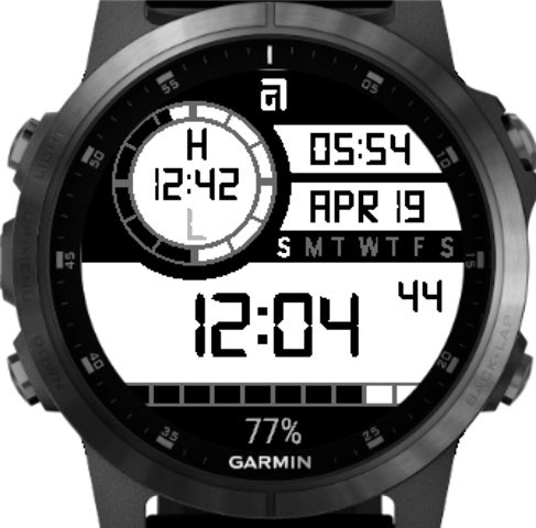
I just designed a watchface for myself and I am drawing all the background elements in the code. See attached.
A bunch of things could be easily done as an image, and just filling some color boxes for highlights.

- What is the difference in memory (and/or battery usage) for a background image called every update vs using background coding?

- Is the quality much better for an image vs the drawing of elements? 

  • With a watchface, everything gets updated either once a minute (low powe) or once a second (high power - after a gesture for 10 seconds).  There's also onPartialUpdate (aka "1hz" weher seconds of the display can be updated every second, all the time.  (displaying seconds is an example).

    When it comes to data, you'd use a custom font (time/date/etc).So, don't think about that right now.  Same with some of the things like the arc and bar would change dynamically

    While you could do the rest as an image, a couple of things there - you'd need a separate image for each display size, and one for each possible color combo.  So, it's a bit more than just memory - it's maintenance.  I'd probably just do the drawing for this one in the code.

    Start with a white background

    dc.setColor(Gfx.COLOR_WHITE,Gfx.COLOR_WHITE);

    dc.clear();

    Then draw a wide black line for the day of week, and a smaller one between the 05:54 and the date, another at the very top,and another under the time, where sizing can be done based on the screen width and height.

    You could also start with a black background, draw the 3 white bars and then the circle and the 10 boxes at the bottom.  Whichever is easier for you.

    The 10 boxes at the bottom wouldn't take much as far as code, nor would the circle with the arc (the tick marks there could be pre-calculated

    This can be done fairly easily with the drawing primitives, and as far as battery, remember that the majority of the time, it's only updating once a minute.

    And you can mix things, like the logo at the top and the circle/arc could be a bitmap.

  • Hey Jim,
    the image you see is an actual screenshot from the simulator. I already did everything using primitives. I was just wondering if it makes more sense to use an image to save memory/battery.
    Currently designing only for me, so different screen sizes are not much of an issue. Resolution is a bit more, as I wonder if a bitmap image would be sharper than some primitives.

  • If you've not set the custom fonts to antialias=true, I'd look at doing that, nit it may not be as noticeable, as your font looks to be pretty straight.  The arc looks a bit rough in the image, but hard to tell how it looks on a device - maybe use a bitmap there, I'm thinking the difference in battery between an image and draws would be fairly minor.

    custom fonts take more battery/time than native fonts.  You can see that in watch face diagnostics for something like displaying seconds.

    CIQ watchfaces will pretty much always take more battery than native watch faces.

  • This is a simulator image using antialiased fonts for the elements, including the outside curves - personally I prefer to get the smoother edges. (I've doubled the size - which is what I think you've done? - in order to make the pixels visible otherwise something in the image format was making them look blurry)

  • how do you get it to be so sharp? I can't get fonts to display as sharp, even with "antialias = true".
    And the arc is also so much smoother than mine. That a simple drawArc. 

  • The antialiasing works because the edges get some pixels in extra shades of grey, which kind of blur together to make the edge seem smoother (but also less sharp). So if you used a background image or font for some of your elements you want to make sure the textures are created with those extra shades of grey.

    When I make things like curves I render them in photoshop - which can automatically produce the anti-aliasing. But another way to do it is to make your texture say 4 or 8 times larger than the end size you want (e.g. 960x960), then draw your elements in black and white to the texture. Then resize the texture to the actual size you want (e.g. 240x240) and it should produce the shades of grey on any curves, as it is averaging some white pixels and some black pixels together.

    If you're not seeing any fonts be antialiased, then I'm not sure! It might be useful to see one of your font .png files and check what that looks like (if it has shades of grey in it).