Heights of system number fonts are way out

I'm just wondering why the font heights (returned from getFontHeight, getFontAscent etc) for the system number fonts on more recent watches are so extreme compared to the actual rendered graphics of the number digits. Compare these simulator screen shots of some tests that I did for the Fenix 5+, Vivoactive 4 and Fenix 6:

My guess would be that the ascent & descent being returned are for the original full ASCII fonts, and are not the values that match just the number digits.

I was going to use the font height values to help decide when the numbers would need redrawing (from their screen area). I guess a simple solution for my case would be to limit the ascent to a reasonable maximum value, and always set the descent to 0.

Top Replies

All Replies

  • Hmm doesn't this also mean that if you're drawing these fonts with a background color (I've no idea for transparent …) then that cost of drawing is going to be about twice as expensive as it needs to be? (Because it's twice the area.)

  • Nothing new here.  You'll see the same on some of the early CIQ devices.  Things like this are defined by the platform groups and not CIQ.

    Using the native fonts are more efficient than custom fonts

  • We use the BMFont tool to generate our font data in the simulator and for most devices. I do not believe that there is any post-processing of the output that is produced. My guess is that this information is encoded in the TTF font file and is being passed along.

  • I do encounter this same "issue" at the moment when using the system fonts FONT_GLANCE en FONT_GLANCE_NUMBER. The margin that is added on the top and the bottom for the glance number digits make the character twice as high. 


    This also makes the use of dc.getFontHeight() useless because it doesn't provide you with the information you requested. Why are these margins there? As correctly said this is undesired behaviour and also corrupts the pixels that you have drawn in the margin when you use a different background color.

  • The fonts you see are the same fonts used by the native FW, and won't change.  This isn't something new and goes as far back as the fenix 3.

  • Yep, I see this on some older devices and also on certain newer device families such as Vivoactive 3.

    It causes problems for me when doing things such as:
    1) Trying to select the largest possible font to fit arbitrary text into a certain bounding box without clipping. If you go by the reported height, in some cases there is a huge amount of margin which caused the selected font to be too small

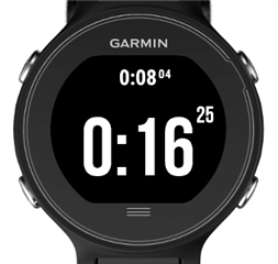
    2) Trying to align text with fonts of different sizes at the top edge. The presence of the margin breaks this process. We can see an example of this in Garmin's own CIQ stopwatch (FR630):

    apps.garmin.com/.../fc9c1ad4-9377-45f9-b53d-ed61f480c3ff

    Note how "04" is aligned with "08", but "25" is not aligned with "16" -- my guess is that both sets of numbers are meant to be aligned. I think the code thinks both sets of numbers are aligned, but they obviously aren't visually aligned due to the margin. This isn't just an educated guess, as I've implemented a similar stopwatch app with a similar scheme of trying to align tiny numbers with the top edge of larger numbers, and I've seen the same visual quirk.

    To solve 1, I ignore the height and only look at the width (which obviously doesn't work in all cases). In other cases I hardcode the actual font height, disregarding the margin.

    To solve 2, I hardcode margin offsets for specific fonts/devices by trial and error.

    You can imagine it's a huge pain to do this selectively for different device families.

  • Things can also be a bit better if you use TEXT_VALAIGN, where you align things based on the center of the font.

    Or you can use custom fonts.

  • Things can also be a bit better if you use TEXT_VALAIGN, where you align things based on the center of the font.

    Would that work when trying to vertically align fonts of different sizes at the top edge (or bottom edge) for text of different sizes, as in the screenshot above? Garmin itself can't seem to do it right.

    Does that solve the problem where the reported font height can be way too large in some cases, which prevents you from selecting the largest font that will fit in a given area? (e.g. When coding a "full-page" data field which renders multiple logical fields?)

    Or you can use custom fonts.

    Which requires dev time and watch memory, which is especially constrained for data fields. The former is also constrained by the fact that I do this in my free time, ostensibly for "fun".

  • And this isn't a theoretical problem as I had literal user complaints that text was too small, when implementing a full-screen data field, which auto-sizes text based on the reported font width and height (*). So it's not just a minor cosmetic problem.

    (* There is open-source code for a popular CIQ data field that doesn't correct for this issue, last time I checked. I think quite a few fields on the store use this code.)

  • Sounds like there should have been more testing and the open source code doesn't handle this.

    As I've said, this isn't new as it goes back to the very early CIQ devices like the f3.

    You'll find a whole bunch of threads about this in the forum.