(No) uniform fonts on Fenix 6 / 6X. Why?

Hi all,

Fenix 3 had IMO great device font - and one font everywhere.
Uniform font across user interface brings familiarity and strong connection with the brand. 

935  I had was similar - 1 font across (although different font)
Recently switched to 6X - and discovering that Garmin stopped this

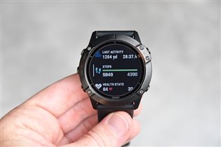
Now - there is a separate, wide font used on the data screens - which coexists in menus with old font
Pay attention to photo below (credit to DC Rainmaker and his review)
(see narrow font for swimming and wide font for steps on one screen)
This is a design mess.

Now check the menus on the Coros Apex Pro from the review below:
https://www.roadtrailrun.com/2019/09/coros-apex-pro-gps-sports-watch-first.html

Yes - they "took" Fenix design - but they did much better job with uniform interface - and use font similar to Fenix 3.
Wish Garmin kept things more tidy here.

Anyone?

  • You're talking the fonts used in native applications on the watch.  This is a forum for Connect IQ (3rd party) apps, which often use their own fonts.  It would be best to post in the fenix 6 forum, but I tell you, the f6 is far from unique on Garmin devices when it comes to fonts.  

  • And presumably with that glance view for widgets, each widget can render whatever it likes, using whatever custom fonts it likes too

  • Not sure about glances and custom fonts right now, as there was a thing with the scoping of resources in 3.1.4 and not sure about 3.15

  • Thanks for the comment.
    Yes indeed - I was hesitating to post - and decided to put it into "Discussion" - since developers have 2 key things vs regular user:
    - design and coding skills
    - bigger influence on Garmin

    I will stop my (bloating) comments here - all I wanted was to call for uniformity of UI interface design, which I strongly feel is a miss here.