Recently I get lot more reports from users than before. But most of them useless. Today I found out why!
I already reported about the inconsistency of the recent changes in Connect IQ app and the website (Contact developer vs App support) but I didn't realize until now that that's not all that had changed:
The user can click App support, and it's reasonable to assume that some of the users know they'll contact a 3rd party app developer, but some probably will think they contact Garmin. Not sure what can be done about this, though maybe adding a sentence on the top might help. Similar to systems that alert you when you click on a link that goes outside the current website, or when you reply to someone outside of your company, Garmin could write something like: detail your issue to the 3rd party app developer.
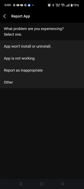
But the real issue comes just now! The user can also choose to click on Report App. This is totally confusing already, but it gets worse. The user is presented with 4 sub-menus to choose from:

Which one should they pick? Ah, they can't install the app? Let's pick that one.

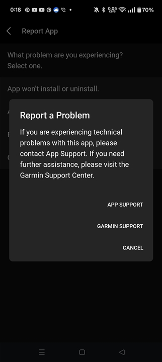
To Garmin's credit, they try to explain something at the top of the pop-up, but I bet 80% of the users don't even notice it and just click at the 1st button, which is.... App Support!
Or they could choose App is not working, which also brings them to the same form.
The user doesn't know about the 2 other ways they could get to the same form, so they don't even think about explaining themselves.
Half of my reports are useless "app doesn't install" in varieties of languages.
IMHO All these should go directly to Garmin babysitter who explains them how to use the expensive gadget they bought recently!
