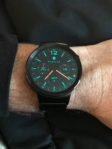
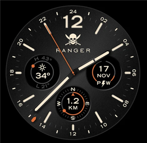
I am looking to create a clone of the Ranger Military watch face that is on the Google Play app store that will look like the the images below. I'm targeting the Fenix 5/6 series for this watchface as I own a Fenix and my other watch faces that I have made are for similar devices.
I'd appreciate any feedback and recommendations on the contrast between the hands and the background of the dial. Knowing that gradient fills may end up somewhat pixelated and not as sharp as I would like. I'd also like to keep a dark black background for the dial if the gradient-like background does not come out as sharp as I would like it. Any recommendations on what to go with for the watch hand colors? One possibility I am going with is a black background, dark gray hand background and then a bright accent/insert color in the minute and hour hands. Any thoughts, comments, or recommendations?
My plan is to maintain the use of anti-aliased graphics as I have done with. my previous watch faces as I like the sharp look of the anti-aliased graphics much better, although I will be going with the vector-based graphics approach (using the discrete drawLine, drawCircle, fillPolygon) using setAntiAlias rather than using a tile-based watch face approach.
Thanks!
My other watch faces can be seen here: https://apps.garmin.com/en-US/developer/7fb21e62-1141-4ac7-a56d-0b2bacdac34a/apps