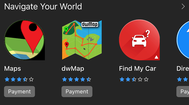
The next version of the Connect IQ Store is adding a dark theme for the iOS and Android apps. Now your app icons can be presented in dark mode against a dark background (#252525) instead of the standard light theme (#FBFBFB).
To make your apps look their best in dark mode, we have a few tips for you to try. If your app icon has a transparency, make sure to test it against both light and dark backgrounds to make sure it is visually pleasing. For app icons with a light background fill, we recommend rounding the outer corners to make them look better against a dark background.
These changes will be coming to the Connect IQ app in early February, so now is your chance to try out dark mode and make your icons pop at launch.
