In the first few months of 2023, Garmin has released (among other products) the Forerunner 265 series, the Forerunner® 965, the Instinct® 2X, the Edge® 540 series and Edge 840 series. In addition to being a testament to the hardworking product teams, that is a lot of new products that will require Connect IQ support for your apps. And if you think that’s the last of the new products for 2023, well, you must be new to Connect IQ.
System 6 adds Personality UI, a new design system for Connect IQ meant to simplify writing user interfaces across Connect IQ products. Personality UI combines a style language with a design library to better facilitate separation of view and business logic.
Authentication
When a Connect IQ app interfaces with a cloud service, one of the first steps the user will have to do is enter their user credentials. This involves asking the user to open an app on their phone. To give the user a sense of control, it’s best to make this a two-step process:
- Tell the user to perform an action to begin authentication.
- Direct the user to the phone to complete the authentication process.
For step one, you’ll want to create a prompt with the action to perform. Step two will be a prompt with no action. It should be clear and progress when the user completes authentication on their phone.
To get started, you’ll create a new Watch App project. In manifest.xml, set the minApiLevel to 3.4.0. Summon the command palette and enter the command Monkey C : Edit Products. Select all of the products in the list, and click okay to add them to the project.
Define some strings for the prompts in resources/strings/strings.xml:
<string id="authenticationPrompt">Press to log in</string>
<string id="openCIQStore">Open the Connect IQ Store to complete login</string>
The authenticationPrompt will go with the first page of the flow, which asks the user to perform the action, and openCIQStore will be the second page of the flow.
To define these pages, let’s open up the Personality Library on developer.garmin.com. The Personality Library defines the components modeled in Personality UI. Go to the Prompts page and then the Prompts with No Title section.
Copy the XML example below into your resources/layouts.xml. Make sure the <layouts> tag wraps everything:
<layouts>
    <!-- Informational Prompt -->
    <layout id="AuthPrompt" >

        <!-- Prompt Body -->
        <text-area text="@Strings.authenticationPrompt" id="mainLabel" personality="
            system_color_dark__text
            prompt_size__body_no_title
            prompt_loc__body_no_title
            prompt_font__body_no_title
        " />
    </layout>
</layouts>
If you’ve written layouts before, the personality attribute may be new. We’ll explain these selectors in a little bit, as they are an important part of Personality UI.
Now let’s create a Monkey C view to display our new layout. Create a new source file source/AuthView.mc that loads the layout:
import Toybox.Lang;
import Toybox.Graphics;
import Toybox.WatchUi;

class AuthView extends WatchUi.View {

    function initialize() {
        View.initialize();
    }

    // Load your resources here
    function onLayout(dc as Dc) as Void {
        setLayout(Rez.Layouts.AuthPrompt(dc));
    }
}
For now, create an empty delegate for your view in source/AuthDelegate.mc:
import Toybox.Lang;
import Toybox.WatchUi;

import Rez.Styles;

class AuthDelegate extends WatchUi.BehaviorDelegate {
}
In your application source file, load the AuthView as the application initial view by editing the getInitialView() function:
    // Return the initial view of your application here
    function getInitialView() as Array<Views or InputDelegates>? {
        return [ new AuthView(), new AuthDelegate() ] as Array<Views or InputDelegates>;
    }
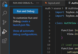
If you haven’t already created a launch.json create one in the Run and Debug section of VS Code:
Let’s run this app on the fēnix® 7. Hit F5 and select the fēnix 7 to launch the app in the simulator:
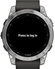
We specified the string in the XML, but how did the text become centered horizontally and vertically? This is where the personality selectors come into play. Let’s look at them individually:
|
Selector |
Meaning |
|
prompt_color_dark__body |
The text color for the body text of prompts with light-on-dark shading |
|
prompt_size__body_no_title |
The size of the body text of a prompt when a title is not involved |
|
prompt_loc__body_no_title |
The starting location of the body text of a prompt when a title is not involved |
|
prompt_font__body_no_title |
The font used for the body text of a prompt without a title |
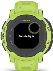
Importantly, these definitions exist per-product. For the Instinct 2, the body text begins below the sub-window and is aligned vertically with the top to prevent interference between the body text and the sub-window:
This is all well and good, but it’s just a text prompt. We’re not really indicating to the user what to press. Let’s fix that.
Action Hints
We’re going to co-opt the action menu button hint as our action indicator. Go to the Action Views chapter of the Personality Library, copy the Action Menu Hint XML, and paste into your AuthPrompt layout:
<!-- Informational Prompt -->
<layout id="AuthPrompt" >

    <!-- ActionMenu hint -->
    <bitmap id="actionMenu" personality="
        system_icon_dark__hint_action_menu
        system_loc__hint_action_menu
    " />

    <text-area text="@Strings.authenticationPrompt" id="mainLabel" personality="
        system_color_dark__text
        prompt_size__body_no_title
        prompt_loc__body_no_title
        prompt_font__body_no_title
    " />
</layout>
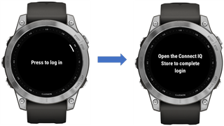
Now when we run the app on the fēnix 7, we’ll get the action hint for the start button:

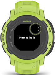
If you run the app for Instinct 2, you’ll get the hint, as well:
Adding the Login Prompt and Button Input
Let’s create the second prompt in our flow. We need another title-less prompt to direct the user to the phone. Add the following to resources/layouts.xml:
<!-- Login Prompt -->
<layout id="LoginPrompt" >

    <!-- Prompt Body -->
    <text-area id="mainLabel" text="@Strings.openCIQStore" personality="
        system_color_dark__text
        prompt_size__body_no_title
        prompt_loc__body_no_title
        prompt_font__body_no_title
    " />
</layout>
Now create source/LoginView.mc. Once again, it will be a wrapper around the layout:
import Toybox.Graphics;
import Toybox.WatchUi;

class LoginView extends WatchUi.View {

    function initialize() {
        View.initialize();
    }

    // Load your resources here
    function onLayout(dc as Dc) as Void {
        setLayout(Rez.Layouts.LoginPrompt(dc));
    }
}
Now we want to handle the button associated with the action menu. Most of the time, this is the start button, but that isn’t guaranteed. Thankfully, Personality UI documents the inputs used in common components, as well.
Create a new source file source/helpers.mc and add the following function:
import Toybox.Lang;
import Toybox.WatchUi;

import Rez.Styles;

(:typecheck(false))
function isActionButton(button as WatchUi.Key) as Boolean {
    if (Styles.system_input__action_menu has :button &&
        button == Styles.system_input__action_menu.button) {
            return true;
    }
    return false;
}
Let’s look at this function. The Personality UI selectors we used in the resource XML earlier are accessible in the Monkey C code space via the Rez.Styles module. In this case, we are checking to see if the system_input__action_menu selector has the button symbol, and we’re referencing it if it does. This is because some products like the Venu® 2 series have a touch area for the action menu. We’ll get to that in a moment.
Personality selector references are replaced with constants at compile time, so adding selectors should not take up precious run time heap.
Let’s add the key handler into our AuthDelegate:
    function onKey(evt as KeyEvent) as Boolean {
        if ($.isActionButton(evt.getKey())) {
            onAction();
            return true;
        }
        return false;
    }

    function onAction() {
        WatchUi.switchToView(
            new LoginView(),
            new BehaviorDelegate(),
            WatchUi.SLIDE_IMMEDIATE
        );
    }
Our onAction() now advances the flow from the first page to the second based on what button triggers the action menu:
Venu 2 Has Entered the Chat
Remember how we said mere paragraphs ago that the Venu 2 doesn’t have button input? Well, when you run on that device, the experience seems… off:
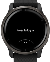
If you’re familiar with Venu 2, you know the action menu button at the bottom typically shows a menu and is not used for advancing flows. Rather than writing a completely separate flow for the Venu 2, let’s make some small modifications:
- Rather than “Press to log in”, we want the action to be “Tap the screen to begin”
- Because the Venu 2 has an AMOLED display, let’s add some background imagery.
- Since the screen tap will trigger the flow, we want to remove the hint.
Add the new string to resources/strings.xml:
<string id="touchAuthenticationPrompt">Tap screen to log in</string>
Now, we’re going to create our own personality selectors. Create a new file named resources/personality.mss:
view_auth__action_hint {

}

view_auth__prompt_text {
    text: "@Strings.authenticationPrompt";
}

view_auth__background {
    exclude: true;
}
This is a new Monkey Style Sheet. It uses a CSS-like syntax to define properties. The resource compiler can read the properties from the selectors, with later selectors able to override earlier ones. One property never seen before is exclude. This is a new resource compiler option to eliminate a resource element.
Now we are going to make the following changes to AuthPrompt in resources/layouts.xml:
- Add a background bitmap reference
- Remove the text="@Strings.authenticationPrompt" from the mainLabel
- Add view_auth__action_hint to actionMenu
- Add view_auth__prompt_text to mainLabel
<!-- Informational Prompt -->
<layout id="AuthPrompt" >
    <bitmap id="background" personality="
        view_auth__background
    "/>

    <!-- ActionMenu hint -->
    <bitmap id="actionMenu" personality="
        system_icon_dark__hint_action_menu
        system_loc__hint_action_menu
        view_auth__action_hint
    " />

    <!-- Prompt Body -->
    <text-area id="mainLabel" personality="
        system_color_dark__text
        prompt_size__body_no_title
        prompt_loc__body_no_title
        prompt_font__body_no_title
        view_auth__prompt_text
    " />
</layout>
If you run the application now on the fēnix 7 or Instinct 2, it should function the same way as before. We created a new background image, only to request it be eliminated by default using the exclude property.
Now create a new directory resources-venu2022. Copy the image below (original available here) and save it as resources-venu2022/background.jpg:

Now create resources-venu2022/personality.mss and add the following:
view_auth__action_hint {
    exclude: true;
}

view_auth__prompt_text {
    text: "@Strings.touchAuthenticationPrompt";
    color: #FFFFFF;
}

view_auth__background {
    filename: "background.jpg";
    scaleX:  100%;
    scaleRelativeTo: "screen";
    packingFormat: "jpg";
}
Quick look at what’s going on:
- We are telling the resource compiler not to include the action hint.
- We are switching the string and color of the prompt.
- We are providing the image, scaling options and packing format for the background.
We need to update our AuthDelegate.mc to handle touch input:
    function onTap(clickEvent as ClickEvent) {
        onAction();
        return true;
    }
Finally, we need to tell the build system to look in our new folder for the following products:
- Venu 2
- Venu 2s
- Venu 2 Plus
- Venu Sq 2
- Venu Sq 2 Music
Open the monkey.jungle file and add the following:
venu2.personality=$(venu2.personality);resources-venu2022
venu2s.personality=$(venu2s.personality);resources-venu2022
venu2plus.personality=$(venu2plus.personality);resources-venu2022
venusq2.personality=$(venusq2.personality);resources-venu2022
venusq2m.personality=$(venusq2m.personality);resources-venu2022
For these products, we’re creating a new centralized location to look for the adapted personality information.
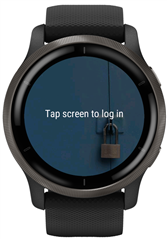
When we run this on the Venu 2, it now looks completely different:
Wrapping Up
This just scratches the surface of Personality UI, but hopefully you can see its power. Personality UI provides a new component library to use as the foundation for your applications. Using monkey style sheets and jungles, you have new flexibility to separate view component definition from your source.

