This discussion has been locked.
You can no longer post new replies to this discussion. If you have a question you can start a new discussion

New Garmin connect mobile updated home page is awful

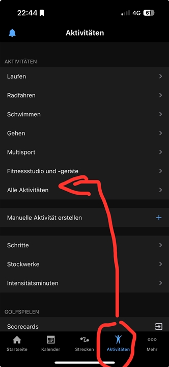
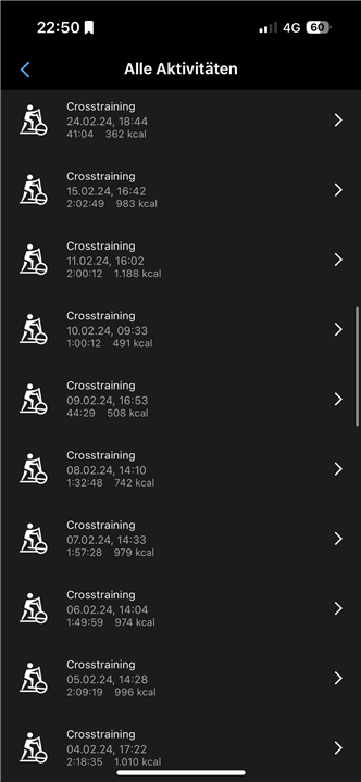
I cannot believe how bad the new Garmin connect home page is. Why remove the ease of viewing my day with one glance of the app?. Now have to scroll through the page to see all the info that was contained in my day section.  On top of that, the user has no ability to bring back the old display or edit it to something similar. This new update is so annoying I suspect my next smart watch won't be a Garmin.

If this home page stays as is, I will no longer be a Garmin user for ANY of their products.

Update to moderator.   Nothing in my original post was "uncivil".  Why do you keep censoring my comments?  

Ray

  • I just like to see all my activities in one screen and swipe down to view them all

    I suggest adding "Activities" to the tab bar.

    To do this, tap on the three dots at the bottom right. Then click on "Edit" at the top right. There you can add "Activities" to the tab bar.

  • Alas not on IoS, except possibly rooting the device, which isn't advisable.  You could get a second Android device to view the data, since its possible to get different versions of the app in the PlayStore and view the data (or view and synch) there (unless Garmin updates its formats to prevent that route).  I use both Android and IoS, so I can avoid the annoying IoS UI. 
    I wish rather than introducing the new UI, Garmin had actually focussed on making a better tablet UI for iPad.  Or provided a 'classic' and 'minimised' version of the UI you could select.   

  • ...alas that is only activities, I use a mix of performance and biometric data.  I did try that but it involves even more clicking and scrolling to get an overview.  I think what Garmin did addressed the compaints by some that the display was full of everything (but even in the old UI you could easily hide data you were not interested in).  The new UI is focussed, but excludes decent overviews.  Thank goodness I dont use that app on an iPhone (just an iPad) where it would be even worse...  

  • that is only activities

    Thats what the op ask for : 

    I just like to see all my activities in one screen and swipe down to view them all

    And I replied to that.

  • Oh yes I see.  My error and apology,  I thought you were replying to a similar comment I made, hadn't realised it was another one.

  • All good. Originally his question was its own thread. A moderator closed the thread and threw the question in here.

  • The new home page is utter RUBBISH  - makes no sense to me AT ALL and I no longer have a clue what I am looking at and can't find anything I used to see at a glance and nor can I make any sense of it!!! Change it back Garmin and FIX THIS, the update is not only appalling but also useless

  • I just don't understand as a customer and shareholder, why have we not resolved this issue and gone back to the previous version? This is very concerning.

  • I'm still waiting for the purpose of this update to be revealed, because otherwise it makes no sense at all.

    I can't understand it either. I switched from Polar. This is my first Garmin watch. I regret it already.

  • As a shareholder you should be very, very happy. Share has gained 70% value in the last 12 months.