Connect IQ was first announced nine years ago at the ANT+ Symposium. Since that time, we have expanded our support from the original four devices (Vivoactive, Forerunner® 920XT, fēnix® 3 and Epix) to over 100 products.
The Connect IQ team is proud to announce the first beta of System 7. With our new API level of 5.0.0, System 7 represents the maturation of a platform that is now almost a decade old. The improvements in System 7 are meant to help you make better apps for your customers.
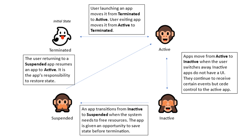
Always on Always
The original Venu was the first Connect IQ device with an AMOLED screen and introduced the heuristics to avoid screen burn-in. Newer devices allow watch faces to keep the screen on in “Always On” mode if the screen is using less than 10% of the display pixels.
With API level 5.0.0, we are updating the heuristic from one based on pixels to one based on luminance. Now the screen will stay on if the display is using less than 10% of the total luminance. This allows you to use more pixels.
Communicating with the World
System 7 also introduces the expansion of some of our communication APIs. In the past, data fields did not support the Communications module directly, instead requiring a background ServiceDelegate. In API 5.0.0, data fields can use select Communications APIs within the main application. This allows for data fields that can better integrate with cloud services.
API 5.0.0 devices can also pair with BLE devices using Just Works pairing. The system will remember the bonded devices and allow you to reconnect with devices you have previously bonded with.
More with Less
System 7 helps you do more with less in a number of different ways. Devices supporting API 5.0.0 have new updates to the system opcodes designed to reduce the code space for common operations. Developers should expect an improvement of 20%– 30% when compiling on new devices.
In addition, one of the fundamentals of Connect IQ is the has operator, which allows you to check in code if an API exists on a particular device. For example, let’s say you want to check if a device supports the new Complications API and decide based on that to use a new or old implementation. It might look something like this:
if (Toybox has :Complications) {
    // Register the new callback
    Complications.registerComplicationChangeCallback(method(:complicationCallback));
} else {
    // Use the old complication approach
    timer.start(method(:oldHandler), 1000, true);
}
The has operator allows you to check if a symbol exists in a class or module. In the past, this compiled as a runtime check, but it will now be evaluated at the compile time in the System 7 SDK when possible. This allows the optimizer to eliminate the branch and unnecessary code, as well.
An Array of Improvements
The intention of Monkey Types was to add a type system that allowed the flexibility of Monkey C but didn’t ask for a lot of overhead. While it has mostly succeeded, there is room for improvement.
Monkey Types offers two ways to type containers. Container typing, which borrows heavily from generic containers in Java or other languages, allows the developer to attach type scaffolding to the kinds of elements that can be added or removed from an Array or Dictionary. Dictionary typing allows Dictionary containers to map what keys can be mapped to what values.
Dictionary typing is almost magical, especially for commonly used option dictionaries. By comparison, Array typing feels mechanical. For starters, unlike every other language construct Arrays are not typed implicitly, requiring additional scaffolding where other elements don’t. Container typing also assumes you want a container of a single type, but in Monkey C it is very common to use an array as a cheap struct. This can be seen in getInitialView(), one of the fundamental APIs:
// So much ugly typing
function getInitialView() as Array<Views or InputDelegates>? {
    return [ new StartView(), new StartDelegate() ] as Array<Views or InputDelegates>;
}
We can do better. What we needed was a Dictionary type for linear arrays that allows modeling the type per index. This now can be accomplished with the Tuple:
function getInitialView() as [Views] or [Views, InputDelegates] {
    // Where did the as clause go?
    return [ new StartView(), new StartDelegate() ] ;
}
Think of Tuple types like Dictionary types, except the key is implied by the order. In this example, the array being returned is automatically typed as a Tuple of types [StartView, StartDelegate]. This is typed against the allowed return value [Views, InputDelegates] and found to match.
The rules of Tuple type A matching Tuple type B are as follows:
- Tuple A and B must be the same length
- For every index, every type in A must be an instance of B
Arrays created with the [ value, value...] syntax will now be typed as a Tuple instead of an Array<Any>. You can use Container types if that better matches the pattern you are implementing, but Tuples have a natural compatibility with Container types. Tuples of type [A, B, C] shall be instance of Array<A or B or C> if the types A, B, and C are in the polytype definition of the container type.
function sumArray(x as Array<Numeric>) as Numeric {
    var result = 0;
    for (var i = 0; i < x.size(); i++) {
        result += x[i];
    }
    return result;
}

function sumThisTuple() as Numeric{
    // This should pass type checking because the
    // Tuple [Number, Number... ] should instanceOf Array<Number>
    return sumArray([1, 2, 3, 4, 5, 6, 7, 8, 9, 10]);
}
Tuple types are also mutable. As the underlying array changes with literal indexes, they are modified as long as the type system can keep up.
function foo(x as [Number, Number, Number]) as [Number, Number, Number] {
    x[1] = "Hello"; // Allowed, type is now [Number, String, Number]
    return x; // Error, type mismatch
}
The following APIs have been changed to use Tuples over Container types:
AppBase.getInitialView() as [Views] or [Views, InputDelegates]AppBase.getGoalView(goalType as GoalType) as [WatchUi.View]?AppBase.getGlanceView() as [WatchUi.GlanceView] or [WatchUi.GlanceView, WatchUi.GlanceViewDelegate?] or NullAppBase.getServiceDelegate() as [System.ServiceDelegate]AppBase.getSettingsView() as [Views] or [Views, InputDelegates?] or NullAudioContentProviderApp.getPlaybackConfigurationView() as [Views] or [Views, InputDelegates?] or NullAudioContentProviderApp.getSyncConfigurationView() as [Views] or [Views, InputDelegates?] or NullGraphics.getCurrentView() as [WatchUi.View?, WatchUi.InputDelegates?]ViewLoopFactory.getView(page as Number) as [WatchUi.View] or [WatchUi.View, WatchUi.BehaviorDelegate?] or Null
This should hopefully lead to less boilerplate typing getting in your way.
In addition to Tuples, the Array type now has a sort method in API level 5. The default implementation uses the Comparable interface, but you can also implement your own Comparator interface to create your own ordering.
Resources
Previously, resource identifiers in the Rez module were typed as Symbol, but in the System 7 SDK they are now typed as Toybox.Lang.ResourceId. This applies to all devices and not just API 5.0.0 devices.
Get the SDK
The System 7 SDK beta is available today from the SDK Manager. You can try the new features using the epix2pro47mmsystem7preview device. If you have signed up for the device beta program, you will get beta firmware in January.


 (Gen 2) Series