Slope profile

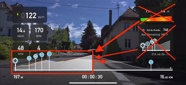
Have one smart profile rather then 3 different profiles, Ive updated this one as the image seems to vanish. There is simply no logic I can think of to having 3 profiles that all do near enough the same thing..Just have one smart profile at the bottom. Have it so you can swipe or auto display the climb profile when on the climb & the full profile everywhere else... have the profile display the grades always. The logic here is when on a climb its the climb profile that's of interest or relevance.  

All that space to the right is then clear of clutter.

  • To flesh that one out, simply look at the purpose for the 3 different course profiles just now in a pragmatic way.

    1. the primary one for the whole ride that’s just now with no grade colour info.
    2. a small box one with the next 200m that’s got grade info.
    3. yet another one that’s now not displaying grade info but info for the climb your on.

    simply add grade info colour to the bottom profile & allow the customer to zoom into the profile to display 1.3km the next 1km & say 300m behind to see anyone chasing ..click again to display the entire present climb or hill that your on & click again to return to display the entire route. 

    1km spread over the entire horizon would effectively give the same resolution as the small grade box plus give you a brilliant way to interact with other riders that are in your immediate interest. 

    have the profile auto display or switch to display the entire climb at the start of the KOM, suddenly you have a massively more intuitive display of the hills difficulty (because you can see the hard sections as red etc) & because it’s the entire horizontal width you can see your friends & opponents much better...the customer then can simply select which profile he wants by tapping it a few times.

  • To add more this would also make the mobile app look a little closer to TDA also. Actually it would make the mobile apps functionally better then TDA 

  • Here is a simple 5minute markup of what Im attempting to talk about....removing two of the profiles which would free space for a removable optional, timer box, give us massively more ride info & also massively improve the social aspect as 1km visibility of the grades ahead would also display any riders you may be catching up in the next few minutes....its the information of whats going to hit you right now & near future...displaying the descent of a mountain permanently all the time for a climb you maybe starting is wasted space, as are timers....you see the time to go...how often do you need to see how long it is to the finish? Is that not the complete opposite of making time fly? Tacx may as well call it "Tacx Clock Watching App" agggghhhh lol 

  • I will add that having a single "smart profile" that you can swipe & have display full profile - Full climb (if on a climb) & Next 1km would massively enhance the user experience. Especially the social side as with Full climb spread over the full width or Next 1km you would be able to chase opponents much easier then now. Obviously Tacx apps are now becoming quite primitive on the social side compared to your competition...it should not mean that even the most basic of basic social cycling is impossible.... like chasing an icon on a profile, why not make the profile in such a way you can actually see the opponents clearly?  1km option spread over the full width would enable this.