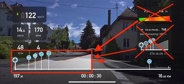
Have one smart profile rather then 3 different profiles, Ive updated this one as the image seems to vanish. There is simply no logic I can think of to having 3 profiles that all do near enough the same thing..Just have one smart profile at the bottom. Have it so you can swipe or auto display the climb profile when on the climb & the full profile everywhere else... have the profile display the grades always. The logic here is when on a climb its the climb profile that's of interest or relevance.
All that space to the right is then clear of clutter.

