This discussion has been locked.
You can no longer post new replies to this discussion. If you have a question you can start a new discussion

Altimeter/barometer graph issue

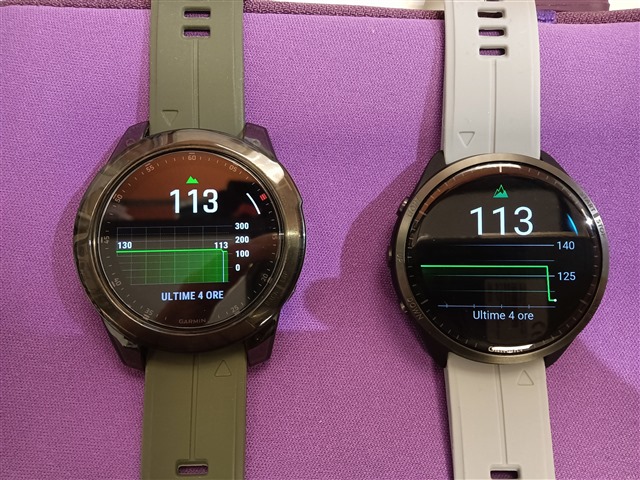
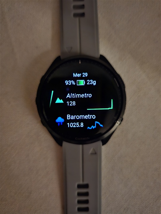
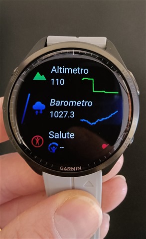
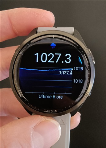
This is how altimeter graph appears as soon as I woken up this morning:

Garmin uses altimeter to take my ECG? Sweat smile
My altitude has never changed during night. 
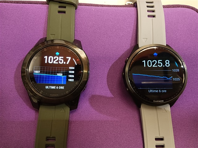
Also graph history seems wrong because yesterday i went to work and come back and altitude should have changed for sure, but maybe was due to very high amount of pressure increase during yesterday afternoon.
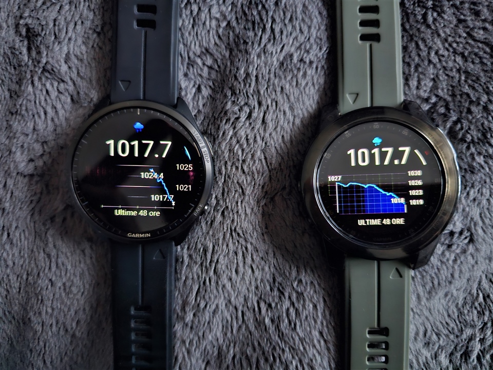
  • Another example:

    What does this graph mean? What is this high spike?

    Altitude remained steady. My opinion is that altitude graph scale to fit the graph: if max altitude change is 1m, is drawn as high to fit the graph as if altitude changing was 10m.

  • There is something wrong with barometer graph also:

    The graph line should be centered.

  • Another example in comparison to epix:

    Graph is centered on Epix and max and min values are displayed, on 965 graph is not centered to actual values and max and min values are missing.

  • Granted, this doesn't look so pretty, but I don't think it is actually a bug (as in: it is technically not displaying anything that is wrong), more like a surprising way to visualize it :). The issue is that they are scaling the y-Axis along the range of values, which allows you to see any *change* very clearly. But if the change is very small, such as elevation just going up and down by 1-2m, then it looks quite wild as a graph.

    A possible solution Garmin could implement is to limit the amount of "zoom-in" on the y-Axis, so that very small changes are never blown up to such scale, but it would probably require them to customize this limit depending on the plot.

  • Yes, this is the "problem", 955 acts the same... They can at least add max and min values. But what would have happened if the pressure had gone over 1030 as in my 3rd post? Why they simply don't use the same Fenix/Epix algorithm?

  • Apart from that this is clearly a bug (they just developed the happy path and missed the edge case), the whole screen on the 965 looks like it was deliberately designed to look ugly, toy-like and stupid.

    I plan to buy this, nevertheless (to have HRV graph, as Venu 2 Plus, that is a dedicated "health" watch is unable to do that), but this, honestly is just a slap in the face, a horrible middle finger to the users.

    Probably they are trying to push the users forward to the Epix, but being a much larger and heavier watch, this seems nonsensical from other than non-realistic management mindset. They still think (and it is still true to an extent ), that they can do anything because they are in monopoly.

    Arrgh, my eyes hurt!

  • Just another thing I found, this is clearly a bug:

    965 doesn't display barometer values higher than 1024.4 in the latest 48h( as can you see from my previous posts,  pressure gone higher), I think because values are gone out of this bugged scale.