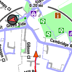
My 955 Solar is currently at Software Version 21.22.
Starting a couple of versions ago, the Running activity map changed style to use pale blue for roads, and dark blue lines for cycle paths.
This is pretty crazy as rivers and other waterways are also blue, and the contrast is also poor, making it hard to see even major roads coming up. The high contrast theme makes things worse, collapsing roads to simple lines.
Previously, footpaths and bike paths were clearly shown as different to roads, and obvious. Now they all look much the same, and hard to see at all. Yet in Hiking mode say, everything is still OK.
There is also a new 'North' indicator coloured russet against a dark grey background, terrible contrast. Good luck making that out while running in rain and dim light.
Garmin, please get some of your developers to try out these changes in the real world before releasing them.
In the meantime, is there any way I can change these things, or do I have to revert the software? (Which I might do anyway as replying/liking Facebook messages no longer works either.)
Interestingly, I tried to do a watch screenshot to show the problem of roads looking pale grey-blue, but in the screenshot they come out a kind of lilac/purple colour which is nothing like the appearance on the watch, but has better contrast (are the developers only using emulators not real watches??):

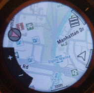
Here is what it really looks like on the watch:

Can you tell the difference between a) the bike paths fanning out across the park, b) the 4-lane highway, c) residential streets and d) the river? Now try doing so while running...!
I would be pretty happy if I could get the default Map or Hiking theme to appear when running. Why the *** has the Running one changed so much, and for the worse?
Thanks all!


