If you need glasses to read - please Share Idea

Once again I am asking community to Share Ideas with Garmin

I guess this is very important even for those who has good eyesight today but will get eventually older

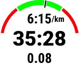
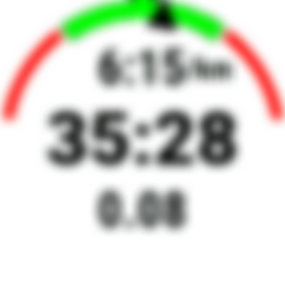
In the past gauges has indicator which looks like Garmin Triangle logo

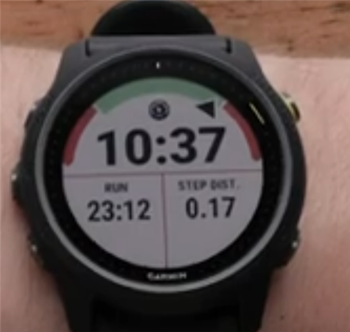
Today this is only tiny dash across color arc. Very difficult to spot if you need glasses to read.

Please compare those images. This is not exactly what we (people who wear glasses) see but quite close. Answer yourself which is better. Versions on the right were made in Paint


It was recently confirmed by Garmin, that reported Ideas has better chances to be implemented than reporting bugs or posts here.

Hence, if you think this is important to you please use that Share Ideas page to let Garmin knows. 

Thank you

Just in case you want to save time, below is template which you can copy paste.

Market Category -> Sport and Fitness or Outdoor and Recreation 

Idea:

Bring back small triangle on various gauges especially Pace or HR, while performing activity. There are people in this world, which needs glasses to read. In the past gauges has triangle (quite similar to Garmin Logo) indicating actual effort. Today this is tiny dash across red / green / red arc. Very difficult to spot by person with limited eyesight.
It would be nice to have it back for all watches not only Sport and Fitness.

You can also copy web address of this post to share above images

  • Bumped up again to keep visibility. 

    Please share idea if you find this important for you.

    Thank you

  • Agree with this idea - I can't see the current indicator without glasses.

  • I'd love to see more options for the activity screens to remove labels - that would allow for a larger font for the values. Why is it only an option for the 3 rows layout?

  • Former Member
    0 Former Member 10 months ago

    Totally agree, they changed Fenix 7 in the same way. For what? I don't undestand it! I don't like reading inserts in my sports glasses, they make trail running dangerous. You could use only one and squint when you want to read the watch, but Garmin could just bring the fat arrow back.

  • Bumped up again to keep visibility.

    For new readers, please use this form to let Garmin know we need larger graphical elements.

    Thank you

  • Bump up again to keep visibility.

    I pinned this thread, so you don't have to keep bumping it.

  • There are also a lot of other pages/data written with small fonts leaving a lot of empty space on the watch

  • Former Member
    0 Former Member 9 months ago in reply to Miky

    Thin and 'wired" fonts, thin lines and black backgrounds save power on AMOLED devices and it makes economic sense for Garmin to standardize on only one UI. 

    The thin gauge indicator however is on an activity screen with a white background. Power considerations cannot play a role here. Probably the change was done to make the UI uniformly 'skinny-styled". 

    But hopefully we can inspire Garmin to implement a user selectable choice for 'thin' or 'fat' UI elements and fonts. It would also help to be able to change background color and element colors.

    For MIP devices it makes no difference in power use, and some users of AMOLED devices would gladly sacrifice battery life for better readability.

    So if we keep sharing the idea here:

    https://www.garmin.com/en-US/forms/ideas/

    and contact Garmin Support for every difficult to read screen, maybe they will take these wishes into account one day.

  • I agree ....but this is what I use a a workaround. Make every run a workout, then use one of the data screens as a pace partner screen. No matter what pace you initially set for that screen once you start the workout the watch picks up the lap pace you have put in for that lap of your workout.

    You can see very easily if you are ahead or behind lap pace, the screen is dark top and bottom and white if not. I agree it can be difficult to see the seconds ahead behind, but not bad. As an alternative you can just use a data screen "overall ahead/behind". That seems to do the same for each lap of your workout and from memory does the same Black/white thing. 

    Final idea is to use headphones, I use bone conducting, and set the watch to tell you your lap pace every minute. It also tells you if your immediate pace is above below what the workout pace is meant to be.