If you need glasses to read - please Share Idea

Once again I am asking community to Share Ideas with Garmin

I guess this is very important even for those who has good eyesight today but will get eventually older

In the past gauges has indicator which looks like Garmin Triangle logo
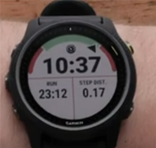
Today this is only tiny dash across color arc. Very difficult to spot if you need glasses to read.

Please compare those images. This is not exactly what we (people who wear glasses) see but quite close. Answer yourself which is better. Versions on the right were made in Paint


It was recently confirmed by Garmin, that reported Ideas has better chances to be implemented than reporting bugs or posts here.

Hence, if you think this is important to you please use that Share Ideas page to let Garmin knows. 

Thank you

Just in case you want to save time, below is template which you can copy paste.

Market Category -> Sport and Fitness or Outdoor and Recreation 

Idea:

Bring back small triangle on various gauges especially Pace or HR, while performing activity. There are people in this world, which needs glasses to read. In the past gauges has triangle (quite similar to Garmin Logo) indicating actual effort. Today this is tiny dash across red / green / red arc. Very difficult to spot by person with limited eyesight.
It would be nice to have it back for all watches not only Sport and Fitness.

You can also copy web address of this post to share above images

  • Bumping up to have more visibility. 

    Please Share Idea, I think this is only way how Garmin bring back larger pointer in gauges.

    Thank you

  • Done. I raised this in the forums a few months ago in the hope that it might be improved. Thanks for continuing to push for it.

  • Overall, as I age I have resigned myself to purchasing and using prescription sports glasses and it has worked well overall with all but the smallest text, which can still be a bit of a struggle.  The one area that I continue to struggle with the most is swim workouts.  One really can't wear prescription glasses while swimming and struggle to view the data on the screen while swimming.  Two things that would help, larger text size while fitting the data most relevant on the primary screen and brightness.  When trying to view small text, brightness really does play into one’s ability to focus and read the text.  I would suggest that in some cases removing the nice lines that clearly tag and separate fields would be favorable if it would aid with providing larger more clear text.

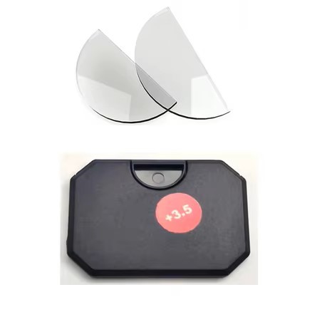
  • I have found in that global web relatively cheap product, which can be easily applied to any glasses.

    I will not mention shop name but you can guess. Anyway in my situation I have those on my sunglasses which I wear while run and ride on bike. But if sky is covered with clouds or is already after sunset then I have to take them off. Not inserts, glasses.

    Then larger gauge pointer would be good enough solution for me.

    I hope you have shared my idea, and maybe Garmin will listen to me and your additional comment.

    Stay safe.

  • Another bump to keep it visible.

    Please share that Idea.

  • The issue itself is the expectation that folks such as myself, choose not to address the real issue: personal vision issues that require correction.  I can use and operate my 955 under full sun, but not in a well lit home or at night unless I use corrective lenses. 

    Solution: If I were to fail to acknowledge my situation and insist that my equipment provider provide a solution, I would prefer a larger display that is Bluetooth connected and can be strapped to my arm/bike/or other equipment that could serve as a display/2nd display to a variety of Garmin fitness related devices.  The purpose to echo the display, provide a larger touch interface and perhaps act as an audio device to call out the numbers we do not see because we also choose not to use earbuds with our device to hear the numbers being displayed to the screen.  I envision such  a device as an echo of the main display, or a supplemental display providing additional information configurable through the Garmin connect app.  I also see that it could be anywhere from 2.5 inches to 5 inches.  As a strap on, potentially it could have skin related sensors, but it could also be wirelessly rechargeable.  

  • The issue is that Garmin has changed software (virtual cost of writing few lines of code) which has made life of people with presbyopia harder. I am asking community here to bring Garmin attention to that problem they have created.

    In fact I would love to read what arguments have been given to abandon large triangle indicator for tiny dash.

    You are talking about hardware which is technically possible, but today Garmin devices support Extended Display over ANT+ only which is not as popular as BLE which by the way do not offer Extended Display profile.

    It would be much easier to have dedicated app for smartphones, but as said not many of those today have ANT+ on board.

  • Could not agree more!
    I remember my frustration, when I received my 955, strapped it to my wrist… and could not see much of the promised data! At the time I barely started to use reading glasses, and this watch was the first real limitation for my eyesight. I get it, this is a tiny screen, and is not easy to fit everything, frustrating non the less.
    There is watch face for “mature eyesight” available that improves some the everyday readability.
    I use to compensate with the audio prompt, but that too is no longer working. It mutes the music, and doesn’t let it back after delivering the info.
    Nowadays, I mostly start the activity, and read the results in my phone afterwords, and only for running. Swimming and other activities data is not really trust worthy, so don't even bother.
    One example of the lack of care for readability:
    Create a screen with 2 fields, one HR gauge, the second cadence gauge. The numbers are tiny, most of the screen is empty. They could be twice the size!
    Now make this a 3 non labels fields, adding pace. The gauge numbers stay the same size, hard to see. Pace is nice and big. With out the non needed icons, gauge numbers could be bigger.
    In all cases, the gauge uses that useless tinny dash line. Why not a full solid progression bar that changes length and color, or as you say, the easy to see triangle? That dash line is only good when facing a desk, not going down a trail...