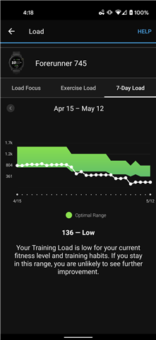
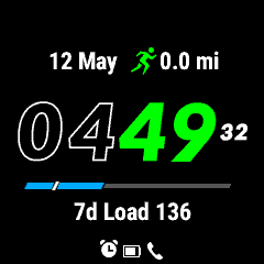
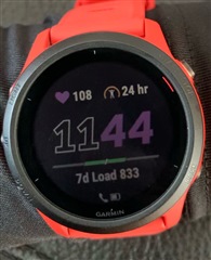
The 7 day load displayed on the watch face is inconsistent with the display in the connect app. Within the connect app the green section indicates the Optimal range, and the white line indicates the actual training load. It appear that on the 745 watch face these UI components are flipped, with the green bar changing based upon current load, and the white line more closely reflecting the optimal training zone.
For example in the following images you can see that, before a workout this morning, my training load is at the bottom of the optimal zone (according to connect), but the watch show the white line at the top of the green zone.
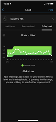
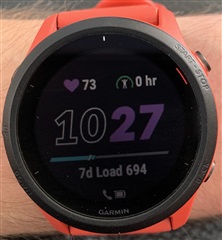
Post workout, it looks somewhat more sensible, but the white line being completely in the center of the green is inconsistent with the display in connect:
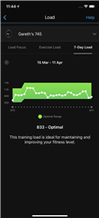
To be useful the watch display should really reflect the UI from the connect app, the green bar should increase and decrease based upon the optimum range (higher if I'm ready for more training at the moment, and lower if I should be taking it easier), while the white bar should reflect the current 7 day load relative to that optimum range.
If these items are not intended to be consistent then can I suggest that the labels and UI elements be revised so that it is clear that these are trying to represent different things?
ps - I suspect the reason this hasn't been raised previously is because this display element only appears to be available on the 745, and for most people (myself included) the majority of the time the display simply has a white line inside a green bar so it looks kinda similar, even if it isnt quite working consistently.
many thanks
Gareth