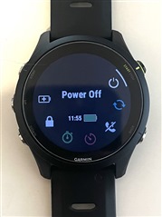
I don't know a reason that need to add time / icon battery in Controls or is that a bug ?
now the front , time & battery icon pack together at the middle of screen .
I think most people spend less than 10 sec in controls menu
so you better to make controls menu more clean instead of adding something
also time / battery is always on the watch face 24/7 .