This discussion has been locked.
You can no longer post new replies to this discussion. If you have a question you can start a new discussion

Feature request: Heart rate and/or power zones colored like with Wahoo

I know this question has already been asked and yes I know that there are many data screens and apps in the IQ store but they are all way to huge and overloaded for something simple what I actually would like to see. Also most data filed require huge space on the the screen where as only coloring the background is way simpler. Coming from a Wahoo what I really, really miss is the Background color for e.g. power and/or heart rate. It would be nice if the background color changes based on the zone you are currently in for both HR and PWR. Even when in a small data field as shown below in the Wahoo example. 
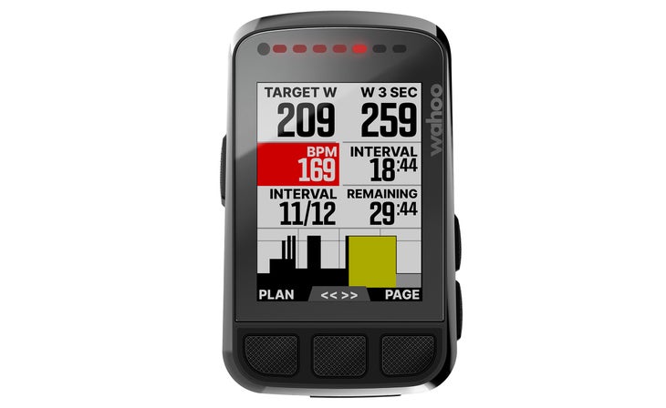
So something like this would be very nice. It should not be to hard to actually code this. But as I am not a coder myself what do I know. Best would be if you could set this based on the zones configured on and off for both HR and PWR. The advantage of this is that with a quick look down on your head unit you could get which zone you are currently in without even looking at the actual numbers. As this is what sometimes is needed only a quick look to see can I still push or am I already pushing to hard.

  • In the meantime I used my tiny programming skills and read through the quiet bad docu and created my own color changing data fields for HR and PWR.

    In case someone is interested you can find them here:

    https://apps.garmin.com/de-DE/apps/41a887fa-0a8e-425e-a75a-2c52410ddbb6

  • I'm a 530 user and don't have a 840 but I used the "DIY" app out of Connect IQ to create exactly what you want. The app seems a bit complicated initially but when you look at the examples it is very easy to use as it is a graphical interface and no coding needed.

    You can create different coloured backgrounds to change colors to reflect what zones you want etc or have the font doing the same and you can also have them flashing if you want them to indicate critical moments. Plus you can make the fields as small or large as you want. Coloured backgrounds or fonts can be used for heart rates, cadences, distances, speeds etc, and also have moving bars on scales etc.

    I use the program to create all my data screens. Most of the time I can just glance down and in an instant see that I have " 3 greens", that indicates I am in the correct zones for cadence, speed and heartrate with no number crunching in my head. If one or more of them is indicating red or yellow or flashing, then I know something is wrong, maybe speed slow or too high a cadence. These 3 zones are not the usual zones for training which I also use, but the 3 smallish zones that I find are the ones that over years of riding find they are the ones that I comfortably cruise along at on long distance events.

    The World is your oyster with the "DIY" program and you can be very inventive and tailor things to your needs either starting from scratch or modifying one of the examples

  • can I use it with another field? like power, np, 10s power, etc? 

  • I don't use power but just looked at the app and you can create fields for "Power" and in the examples people do create data screens that use dynamic colouring.