Tiny screen items are impossible to see while riding.
Tiny screen items are impossible to see while riding.
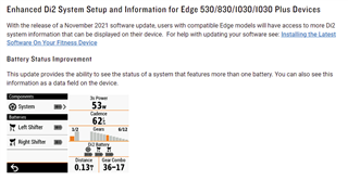
In order to support shifting systems with multiple batteries, we updated shifting system battery status fields to graphically represent the component and status. This change applied to all fields to maintain…
Agree with what’s being said here , the new battery level icon is a backwards step.
The actual percentage figure was great and to change it with this latest update is just daft and obviously programmed…
I used "di2 battery" for my E-bike with steps e8000, is horrible to loos the % value
i hope it will come back, i dont wont buy a "ew-en100"
agreeing with ic3cold, bring back %