This discussion has been locked.
You can no longer post new replies to this discussion. If you have a question you can start a new discussion

Edge 530 - LARGER FONT FIELDS

Hi everyone,

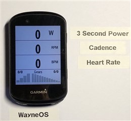
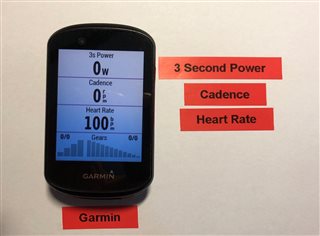
Like many people over the age of 40 in this group, I was disappointed to see that the Edge 530 actually has a smaller font than devices with smaller screens, and that lots of space is wasted on the screen meaning that some of us can't see the important numbers we need.

A mate of mine has been made redundant due to COVID, he's a developer and know many languages, so I asked if he could build me some larger font fields, just to make him feel useful really.

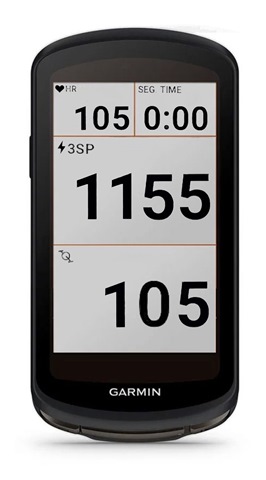
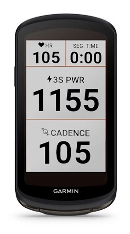
Well he's done it, he's used the largest default garmin font he can, and it's most suited for 4 data fields on a screen.  He told me using the default font is likely to use less power than a custom font, so though it important to use that.

He's started with

3 Second Power
Cadence
Heart Rate

as those are the ones I use, he's willing to do more if he can get a few dollars in for the fields he's done.

Have a look here

https://apps.garmin.com/en-US/apps/5f2009bd-59fc-4256-83e1-a059f61c7347

  • Former Member
    0 Former Member over 1 year ago

    pretty cool... but could you actually have custom fonts for 3 fields only, and then the option to choose what you want to see as those three options?

  • Former Member
    0 Former Member over 1 year ago

    what I do not get, is why does garmin not make bigger fonts available like on Wahoo.... since years. As if they would lose face if they would finally do it. 

  • I tried today a more generic solution to this font problem with https://apps.garmin.com/en-US/apps/b0346b71-bf01-4070-96d6-3de66dcc8233 It took me a few hours to build my own data screen, but don't regret the time spent. 

  • Former Member
    0 Former Member over 1 year ago in reply to rderidder00

    Can not see anything. Only leads to a link of an app. And that only shows pages filled with too much data.

  • Larger fonts should be available without connectiq datafields, it's the minimum garmin can do !

    Garmin should look Wahoo basic fields (colored, very big font that use available space, ....) before add useless features that are unreliable.

  • I think we should phone and send e-mails to Garmin company about this matter. There are other manufacturers of bicycle computers: Wahoo, Mio, Polar, Bryton, Sigma, Holux...So tgere is a competence on the market and Garmin should produce such devices as its customers want to have. Not every biker can use apps like

    HMs DIY #1

  • thing is, they do not care. Each time I get a garmin, I edit layouts and send them. You do not even get a reply.

    With the actual sizes of max font size on Garmin, you could do the following. So they not even need to change fonts... just make the layout better.
    But they not care... 


    This would be so much nicer.. and then when you have three big fields, they could remain this size.
    Also, a version, where the font is upright for the Units would be good, better even. but then they would need to change font, system, .. this would work without any changes

  • this is how cluttered it looks now:

  • Well...so we have to cope on our own. This is similar to the matter of fonts and colors on the maps we use in Garmin devices. I use TYP VIEWER and  Gmap Tool to prepare my own skins. For example I wanted to have larger village names and obtained this on Open Street maps. And I do not like red roads on the maps as I prefer the color only for hiking/biking routes and courses. Maps on Edge screen should be easy to read out. Unfortunately when I use High Contrast theme roads get extremely  wide (on some map types)

  • I wish we could do this with the cue sheets.    The fonts could be about 50% bigger without a layout change.