This discussion has been locked.
You can no longer post new replies to this discussion. If you have a question you can start a new discussion

Font size of data fields in comparison to Edge 820

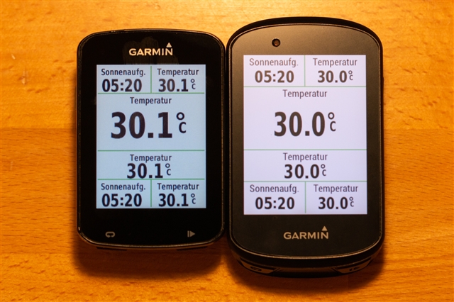
When laid next to each other, data fields on the Edge 530 appear smaller than on the Edge 820, see picture. That's due to a visual illusion, as there a more space for each data field on the larger screen. I measured the digits with a ruler and they are exactly of the same height on both devices. However, that's not what I expected when I decided to switch from 820 to 530. One motivation was the larger screen and while it does provide benefit for the map and other graphical data pages, it has no effect on the font size of numerical data fields.

Since I am using data pages with numerical data fields most of the time during my rides, here comes my question:
Are there any plans to increase the font size of standard data fields on the Edge 530 so that they better make use of the available space similar to the Edge 820?

Speaking of font size: I have a long time wish to increase the font size of data fields even further. My main data pages haven't changed for years now and I know by heart which data is shown in each field, so I do not need the description on top of the data fields. It would be great to be able to switch off all field descriptions on one data page and by that increase the font size of standard data fields. This switch could be per data page. Just wanted to share this idea.

  • I completely agree with you. There should be the option for bigger font sizes and for that matter more layouts to take advantage of the font sizes.

  • Totally agree. The fonts need to be legible for at speed. Probably most Garmin engineers have never rode further than company parking lot.

    Does the larger font consume more battery? 

  • +1. For people over 45 years old is important the font size. It is not understood to put larger screens to maintain the size of the font. So, what is the benefit in this size screen against 520 screen?. I will see information in the same size. Its a joke¡¡¡

  • Here's another wish from real cycling experience - give us the options to change the font sizes - especially the turn notifications. For roundabouts it would be great to have larger arrow signs to show which exit - the current turn advice is too polite. I had to seriously take a good look at the unit (dangerous as i'm taking my eyes off the road) to ascertain which exit i should be taking - if it was larger it would allow me to quickly glance at it and move on.

  • Sounds like you should look at some of the CIQ data fields out there where they aren't limited to what Garmin selects for fonts and layout.  Better yet, if you have some development talent, or know someone who does, have them build you a CIQ field that shows exactly the data you want in the font's you want.  Personally, I agree with you and almost always use my own custom fields for this as I also like having the various fields colored to make them much easier to identify, especially on the trails.

  • i've had a brief look at the IQ connect site - but nothing practical came up - any suggestions?

  • That is a good idea.  Having an option to remove the descriptions in return for larger fonts would be really good.  Especially for use during races.

  • My thumb up if someone from Garmin counts the votes

  • I had my first ride today with the 530 and do think I'll simply return it to the shop. These font sizes are sick...
    Any response from Garmin?

  • OK, AND OMG. I thought it was just me - getting old. This is totally lame and explains why everything seems to be a blur. Might be time these old eyes looked into 1030. I just bought this 830