1050 issues / software ux improvements

A few pieces of feedback for you, Garmin software folks, on the new 1050

  1. Data field formatting should be improved and optimized for the new display resolution.
    1. Gearing datafield wasnt updated for the resolution increase. It's hard to read and they waste so much space. Can you fix this finally on the 1050?

      The front chainring bars still smash into the X/2 text which looks sloppy and distracting. 
      The bars' grey outlines are too hard to read on the new rez - they're too thin. make them black and thicken their outlines
      use the white space! make the bars shorter and use up that space. looks silly
      move the cassette X/11 out from under the varia icon (i know it's positional and only is issue in top location but this generally applies to all datafields)
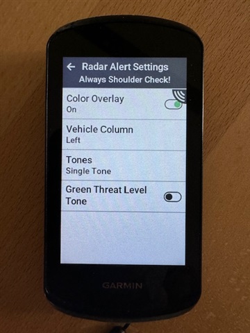
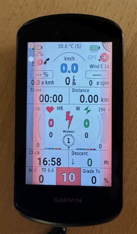
    2. Can you come up with another way to show the radar is active besides covering datafields?

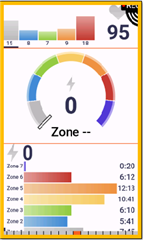
    3. Why does a brand new power zone graphical datafield (see image) have the singles digit 1 pixel from the edge? I'm assuming it's to allow for over 1k watts to display but just adjust the colored bars to the left slightly to make it not look so silly and distracting.

    4. Generally most data fields are identical to x40 x30 units. Didn't bother to improve their graphics, text size, font, etc with the new display. pretty silly bc while the screen looks good some pages can still look like they're from the 2000s. Improve fonts, increase font sizes, center text in the fields (both in X but also Y)

  2. the new swipe-to-display more data on Climb Pro and Strava Segments is nice but it doesnt persist so if you change screens and then return, it resets. frustrating if you switch screens a lot. please make it persist for a ride at least.

  • I will add one more of my suggestions to these good suggestions, to make a discreet, short sound signal when turning it on so that you do not have to hold the ON button until the inscription: Garmin appears.
    One cool thing that comes to my mind is the ability to copy banished screens between activity profiles and to be able to set the order of profiles as is done in widgets.

  • You are forcing some of those new data fields in to the smallest possible space.

    They do look better if you give them more space


    I have already submitted an enhancement  to retain the slider position.

  • hm yeah interesting - i have the time in hr and power zones on their own page - but if they're going to offer graphical data fields to be used in these smaller field sizes, they should be formatting correctly. it's not like there are thousands of fields to ensure they look professional and polished. especially with the new fancy screen - the data fields do it a disservice

  • Can you come up with another way to show the radar is active besides covering datafields?

    I second this. 

    I believe on the 1040 you could choose what side the radar notification was on. Left side, right side, or both. Unless I missed it I don't see that on the 1050. It shows the bars on both sides. I always set my 1040 up with it showing radar bars on the left side. Still covers data fields but not nearly as bad as when having both sides active. At the very least give us that option back please.

  • In E1050 you can also, go to sensors->radar->info

  • Yeah I see that it's there. I have it set to show the dots (vehicles) on the left side. But it still lights up both sides with the color to indicate approach speed. 

    I could of sworn with the 1040 if you set it to left side you would get the dots on the left side and the color indicator ONLY on the left side. I have already sold off my 1040 so I can't go and retest. 

  • That is the color halo you can switch that off.

  • Yes I know that but I do like the color warnings. I would like to keep them.....but only on the side I have set. I could be totally wrong but I am almost positive the color warning didn't go around the entire screen on the 1040 if you have it set on left. Or maybe due to the 1050's better screen I am seeing it now? I couldn't see anything on the 1040 Solar screen....I always hated it.

  • Your memory is fooling you!


  • ***....thank you for that!  Yup my memory is full I suppose. Maybe it was my Karoo 2 that had that feature?  *** I am questioning if I had the color halo on with the 1040 now....ha! Or maybe I just never noticed on the 1040 and its more clear on the 1050. Like stated I never got on well with the 1040 Solar screen. I happily took the battery hit on the 1050 for the screen!

    On my ride to night I am going to turn the color halo off....maybe it will jog my memory.