SEE 10/April 2025 update https://forums.garmin.com/sports-fitness/cycling/f/edge-1040-series/403065/larger-map-user-icon-cursor-has-arrived-27-09b/1922305#1922305
I am sorry and very embarrassed that I am still harping on about a larger user location cursor / symbol on the map for 1040, 840 & 540 just like the one on the 1050. More than half the members of my club (and it's a big international one) say that the #1 enhancement they would like is a larger symbol especially as many of them (like me) have been riding for a good while and have declining eyesight (for fine detail) especially at night, in rain, after a few days in the saddle. Getting a 1050 is NOT the solution as we try (sometimes succeed) to do mostly stupid distances over multiple days (up to 90-210 hours) and battery life is also a priority.

I have mostly kept my obsession to the beta forums where I have raised it in each version for the last year to so and especially since the 1050 got the larger symbol. The request in each of these beta versions has scored the highest "up-vote" count for that version indicating a significant level of support, In the 24.xx beta this request got 110 up-votes, a record number (by 5 times) for any request on any device in the last few years. I had been advised that this stood a good chance of being done but as we get down to the tail end of the 26.xx beta it still has not been done.
Given it is already on the 1050 the cost / effort for Garmin is as close to zero as a change can be. Even just swapping the sizes of the current cursor & the Virtual Partner (currently twice as big) would be adequate and make two large groups happy (endurance riders & VP dislikers)?
So I am having another go, if you want to up-vote it that might prompt Garmin to do it? Go here and up-vote (up-arrow)
Thanks
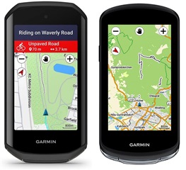
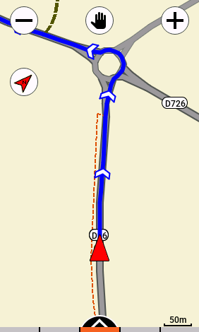
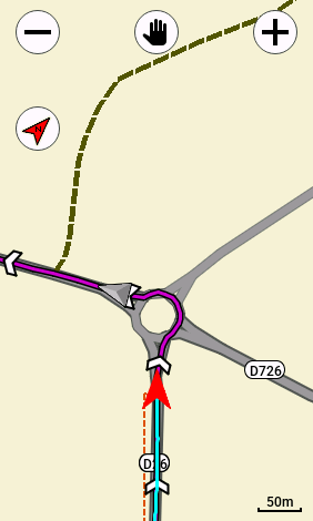
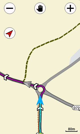
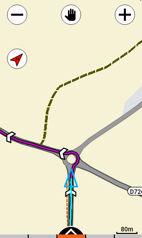
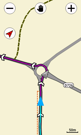
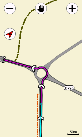
1050 1040