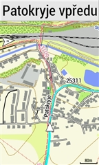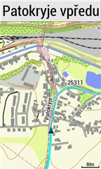

Which cursor size is better?
This option was removed by the GARMIN programmer from a previous version of FW because he has good eyes. We who have worse eyes are unlucky. I bought the 1030 and 1030 plus only because of the size of…
Garmin should deliver high quality at such a high price. Users of the 1030 plus know the weaknesses of this model very well. Only Garmin pretends everything is fine.
Thanks, I wonder what then controls the cursor size (like the bigger blue one in the Garmin High Contrast Theme)?
It seems the Theme files modify some internal programmed defaults,noting the "Classic" theme has far fewer Theme elements so must be taking defaults from somewhere (probably the colors from the IMG map files) for the map colors which are not modified but what causes the High Contrast Cursor to be larger? Hope I don't spend most of the holidays trying to hack a Garmin Theme rather than just riding!
PS. Maybe it is the "outline" color? The Garmin "Classic" (default as there is nothing for this in the Theme) seems to have a white outline while the HC blue one (and yours?) have black and therefore "appear" bigger? (these are Garmin "original", I haven't used yours yet as I still have old FW (hate those arrows)


Leave the hacking to the evening, ride during the day. The best solution.))
On the contrary, I like your hated arrows, this was a good idea))
Another test today. Without navigation, the red cursor is better. The white cursor is better when navigating.


I like your hated arrows, this was a good idea))
Yes but like many of the "improvements" in the last 2 releases they should be optional, if you like them, keep them, otherwise have option to disable them, I have some routes where I get more than a dozen of them on the map screen (one with 15!), nothing left of the route showing.((
what causes the High Contrast Cursor to be larger?
It is not larger!
It is an optical illusion because of the outline. (...as you assumed...)

It seems the Theme files modify some internal programmed defaults,noting the "Classic" theme has far fewer Theme elements so must be taking defaults from somewhere (probably the colors from the IMG map files) for the map colors
I'm sure you're right!
Mapthemes "overrule" default colors.
Thanks to Alan & mcinner1, these more visible cursors via Theme hacking (I prefer the red and HC light blue) and the more visible Course Points might just force me to hold my nose regarding the direction arrows and finally install the latest FW (note I didn't say "upgrade")