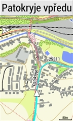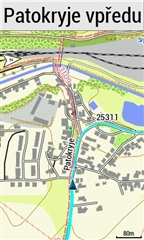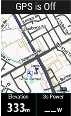

Which cursor size is better?
This option was removed by the GARMIN programmer from a previous version of FW because he has good eyes. We who have worse eyes are unlucky. I bought the 1030 and 1030 plus only because of the size of…
Garmin should deliver high quality at such a high price. Users of the 1030 plus know the weaknesses of this model very well. Only Garmin pretends everything is fine.
For the Edge 1030 Plus it is theoretically possible to change the cursor characteristics using the .kmtf files in the MapThemes folder.
Unfortunately it is not possible…
You should be able to change the color, but not the size by editing the map theme.
It is not helpful to edit the existing *.kmtf files, because they are replaced by the original file when the device is restarted.
You have to create a new file (new name) by copying an existing one and then edit it.
I did this with the Classic.kmtf and for control I inserted the color scheme for River/Channel and set it to red.
Also, I set the tag field="MPM_ACTV_CRS_CLR" - which I assume might have something to do with cursors - to white.
I set the tags for name and description to High Contrast, because the cursor triangle is simple for that mode.
But nothing works...
So the following is an example of changing the colors on the rider position icon on the map page.
I took a copy of the high contrast theme and renamed it to a custom name.
I changed the profile to use this custom theme.
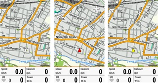
For demonstration purposes I re-colored the user position (cursor).
This has 4 parts. The boarder that I left black.
The left side, which I colored a shade of yellow.
The right side that I colored a shade of red
The arrow cutaway at the bottom on the cursor that I left blue.
The default for the theme I copied is that all three of the above are blue.
I then simulated being at Garmin head quarters for the screen shot.

The cursor is on top of a saved location, which is the little blue flag behind it.
Here is the code for this
<style field="MPM_VEHICLE_BRDR_CLR">
<color>
<primary day="#ff000000" night="#ff000000"/>
<secondary day="#ff000000" night="#ff000000"/>
</color>
</style>
<style field="MPM_VEHICLE_CLR">
<color>
<primary day="#ff000000" night="#ff000000"/>
<secondary day="#ff000000" night="#ff000000"/>
</color>
</style>
<style field="MPM_VEHICLE_LEFT_CLR">
<color>
<primary day="#ffF8F405" night="#ffF8F405"/>
<secondary day="#ffF8F405" night="#ffF8F405"/>
</color>
</style>
<style field="MPM_VEHICLE_RGHT_CLR">
<color>
<primary day="#ffF82C11" night="#ffF82C11"/>
<secondary day="#ffF82C11" night="#ffF82C11"/>
</color>
</style>
<style field="MPM_VEHICLE_BACK_CLR">
<color>
<primary day="#ff00a8f8" night="#ff00a8f8"/>
<secondary day="#ff00a8f8" night="#ff00a8f8"/>
</color>
</style>
<style field="MPM_VHCL_HGLT_CLR">
<color>
<primary day="#ff000000" night="#ff000000"/>
<secondary day="#ff000000" night="#ff000000"/>
</color>
</style>
Thanks for your efforts here Alan, they are appreciated. I have been meaning to get into those Theme files but I went back to a previous FW so wasn't motivated to play with them. Neither the Classic or Mountain Themes have MPM_VEHICLE elements, they must use some programmed defaults, I wonder if we create a custom theme based on the Classic (say) and copy in the High Contrast MPM_VEHICLE elements whether it will then give the bigger more visible cursor? . What I would really like to eliminate is the Direction Arrow / chevrons but doubt I can do it with the Themes
Thank you, aweatherall Alan! Perfect!
I managed to create custom colored cursors for Classic Maptheme (because Classic is the most common theme - I assume...)

For all who are interested:
extract the zip file which contains 3 color cursor options (plain and 3D each).
-Copy the files to your device \Garmin\Mapthemes
-Start your Edge and goto: Profile - Navigation - Maps - Mapthemes (first line of Maps)
-Chose the desired color
To answer possible questions already now:
it is not possible to enlarge the cursor or make the outline thicker.
NOTE:
If you return to the original Classic theme after using one of the custom colors, you have to start the device anew after chosing "Classic"!
(because the original Classic file contains no information about cursor color. It will stay as it is!)