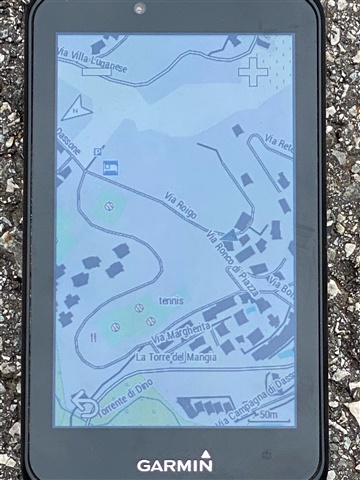
Hi Garmin,
I have posted about this issue a number of times and I am getting increasingly annoyed. The cursor (location indicating where I am on the map) is ridiculously small to the point where a person with normal eye sight often needs to play the "Where's Waldo" game to find out where I am.
There WAS a version of the operating system including an option to set the cursor to a nice large white triangle with black border. That worked really well. Then you–Garmin–took it away for no apparent reason. You have crippled my device to the point where it is a real and constant pain to operate. The picture below is one of the better use cases. Following a Trailforks trail (black), looking for a black triangle that is barely wider than the path of the trail on the display, is nothing short of aggravating.
I don't remember the "and we removed the following useful features..." section in the release notes. Garmin, you have rendered my device a real pain. Fix this issue or reimburse me so that I can buy a product that actually works.
There have been a number of very useful hints from other users but my point here is that it is time for Gamin to fix the mess they made. Garmin, why are you:
- not actually reading the comments in this forum?
- generally ignoring good UX design including accessibility? How else would you come up with this kind of terrible design?
- not ever acknowledging user concerns? How about commenting with something like "we look into this... "
- removing essential features
Clearly the problem CAN be fixed. The large white/black triangle existed in previous versions. Also, there is the (oh don't go there) virtual partner cursor. Even that one is much larger. Why would the most important piece of information - your location - be maximally obfuscated by design?
If you don't plan to fix this issue please tell me and give me back my money.


