SW 26.00 BUG REPORT : start value of VO2max chart (within Training Status widget) is fake

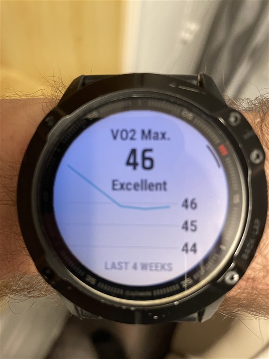
After Garmin added the Training Status widget to Fenix 6X I thought that its VO2max chart was perfect. If I cycled more and got more frequently VO2max values then this chart simply depicted the cycling VO2max values. When I ran more than the values were based only on running VO2 max values.

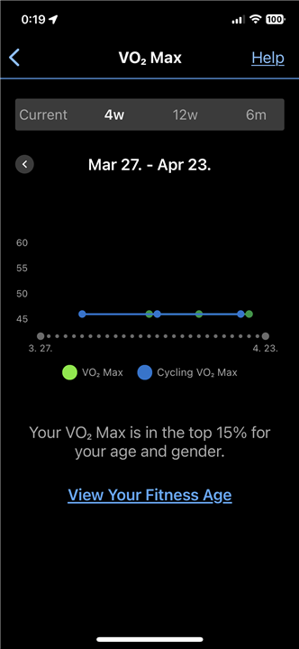
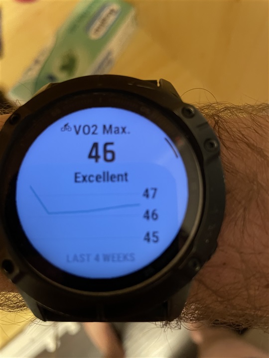
But recently I started to assume that the chart sometimes uses both type of data, and it is the smaller problem. My example: last time I cycled was on 24th December 2022. I got 48 as VO2max, which was a confirmation of my earlier values of 48. Fine. Since then I ran and got values of 46. Technically the chart was a sort of “descent” on the left then a sort of almost flat. I was waiting that around 21st January it would be almost flat (see 4 weeks, which is 28 days).

But it did not happen, the older than 4 week old cycling values were shifted to the right. So for a couple of days the” descent” were fading away, but before getting the almost flat type of chart then the whole “descent” section re-appeared.

Yesterday (38 days after getting my last VO2max value being bigger than 46) finally the chart became almost flat, so it included only the correct values. But today the pretty old value of 48 re-re-appeared again. So my VO2max chart of 4 weeks starts with a fake “descent” section from appr. 48 down to appr. 46, and it follows with a section depicted using the realdata of appr. 46.

What the heck! Has anyone had the same sort of observation?
Of course one has to have a cycling powermeter to get a cyclingVO2max, but maybe there are more here with it.

  • Just to make it clear I had reported it to Product Support, too, but I am afraid that if other users having and using powermeters do not care with this problem then I have zero chance, whatever screenshots I make. But here are what I was telling you:

  • A couple of weeks ago I was very happy, because my cycling Vo2max also dropped to 46.

    I started to check the Training Status widget, and after 3-4 weeks later (it was like a week ago), the value of 48 coming from the very old cycling VO2max (last December) did disappear from the 4w chart on my F6X.

    But 3-4 days later (so 3-4 days ago) it appeared again as a data of 3.5-4 week old (left end of 4w chart).

    Sidenote: as I already mentioned in my post above, in early 2023 I exchanged emails with Outdoors Product Support and they could not help me. The final answer was that the engineers thought it worked as it had been designed.

    Yesterday I rolled up my sleeves and after a backup I master/hard reseted my watch including both data and settings.

    After pairing with GC without restoring any files the first thing I checked was the Vo2max chart of Training Status on my watch.

    The same bloodily fake data was there.

    Conclusion: this chart comes from GC, so there is no way to repair it. Maybe if I close my GC account. :-)

    The only thing I am chewing upon: am I the only person who has ever faced this stuck VO2max value, which might come from the dual approach (different cycling and running), or it is for all people with powermeters (afaik it is the prerequisite of cycling VO2max and cycling LTHR) ?

  • I honestly cant see what the problem is.  If you say that the last time you  cycled was the 24th December then there wont be a graph (blue line) for VO2Max Cycling.  I have what you call a fake decent on the graph on my watch too - it shouldn't be there but I dont think it affects the rest of the graph.  Your running VO2Max is not stuck - it is climbing very slowly.  Try some high aerobic runs to drive it up a bit.

  • If you say that the last time you  cycled was the 24th December then there wont be a graph (blue line) for VO2Max Cycling. 

    Sure, I agree. The problem is only on the watch.

    I dont think it affects the rest of the graph.  Your running VO2Max is not stuck - it is climbing very slowly. 

    Still agree. The less older data are correct.

    Try some high aerobic runs to drive it up a bit.

    It was not my point, I am not unpleased with my vo2max.

    I honestly cant see what the problem is.

    The problem is that an older than 4 weeks vo2max data (either running or cycling) should not be part of a chart of the last 4 weeks.

    Ad 1.: in my case this cycling one simply hides the running ones which were factual around 3-4 weeks ago. So you cannot check the development of 4 weeks just like of 3 weeks.

    Ad 2: I cant see the logics of this recurrent re-appearance of an old data. On day X I can say I could finally get rid of it. On day X+1 still, and then voilá on day X+2 or X+3 it is there again.

    Ad 3. As I wrote since my posts above I cycled again and got lower cycling vo2max data than the old 47 one, ithey were somewhere between 46.0-46.4. But they were not used for the chart. I could say that our watch/GC iis so intelligent that it decided to use only running vo2max data, because there are more than cycling ones, so it represents your ability better. It would be a good approach, (much better than depicting both cycling and running LTHR on the same graph and  assigning a running LTpace with a cycling LTHR in those cases when your latest LTHR comes from cycling.), but if it so how the heck can any cycling vo2max data be there (I mean this older than 4 weeks old 47).

    So it is my problem. Not a depressing one, but the bug is so evident.

    Maybe one day I am going to start parsing all my fit files for 1-2 months, using the Vo2max values stored in them I am going to draw a chart of 4 weeks and  will screenshot the chart on the watch just to compare them and show that a) there are ghost data there b) sometimes there are missing ones also.

  • A new example of craziness. When I wrote my last post, yesterday, the 4 weeks chart was more or less stable, all the values around 46 (+/-0.3 or so).

    I did not photo it, but believe it to me please.

    Now the local time is around 20 minutes after midnight, I checked it again. A fake start value of around 47.5-48.0 appeared (I did not see such a high value since last November), and this time the fake part of the chart is almost 2 weeks, meaning the incorrect “descent” overlaps the real values of almost 2 weeks, which values were visible until midnight.

    And again it is. a proof below that neither my running, nor my cycling vo2max was 46 and not more in the last 4 weeks.

  • The problem with the graph on the watch is the starting point on the left.  Then the line descends to the first of the 3 vo2max points that you achieved in the past 4 weeks which seem to be graphed correctly.  Its seems you only do the occasional run.  The graph on my watch usually starts at a similar (incorrect) point but drops very sharply as I run almost every day.  So yes its a bug in the watch and should be reported/fixed.  

  • Exactly.

    Let me add that in those periods/weeks when I did not have any runs with a “vo2 max check” (=long enough and intense enough ones), I did some occasional cycling. So in the first half of this 4 weeks period, when I did not run.

     Yesterday I could see data of around 46 for the whole 28 day period, and it was a sort of smooth “curve” with slight “arcs”. So yesterday not just my data achieved by runs, but those achieved by cycling were used for the chart.

    Today the vo2max data of my cycling made on 1st April is not used for the graph any longer. Which may be another bug, provided the chart was designed to use both type of vo2max  values.

    I wondered whether it had any effects that I use Edge530  when cycling, and although my F6X is recording also, it does not work in “cycling mode” and I never save those activities, but discard them. (The reason of this “protocol” is the collection of intensity minutes.) My bet is that the involvement of 530 does not influence it, otherwise I could not have seen proper chart yesterday either.

    My only remaining question is whether this starting point relates to cycling, or it is a purely fake, never achieved data.

    Just to locate the bug. You also have a fake starting point. Do you cycle and get vo2max data from those, too? Because if you dont then the fake start pointing has nothing to do with cycling.

  • I haven't done cycling with a power meter in many months and I doubt that has anything to do with the problem.  Today the graph on my watch is 100% accurate because VO2max data was recorded on the day exactly 4 weeks ago.  It seems to me that if nothing was recorded exactly 4 weeks ago then an incorrect starting point for the graph is chosen (and thus you see the effect of the "fake descent") instead of the watch starting its graph with the previous recorded vo2max data (obviously adjusted for its date).

  • Good bet.

    Thank you, Ronand, for helping me with understanding what is happening. The main benefit was the exclusion of some confusing effect of mixing cycling and running VO2max values, because they are really not mixed at all.

  • Additional info: the same bug of the fake starting point happens for cycling vo2max chart.

    Today I had a ride. It changed the vo2max chart on the watch intraday, and now it shows cycling vo2max values now, it is quite sure, because there is a bicycle icon at the top.

    To be honest I dont remember whether I ever saw this bicycle icon (

    EDIT: When I wrote in my OP " If I cycled more and got more frequently VO2max values then this chart simply depicted the cycling VO2max values." I did mean that, but it was just how I interpreted it having seen the data, and not because of spotting any icons.