Swim workout rest background color now yellow and makes the white text unreadable

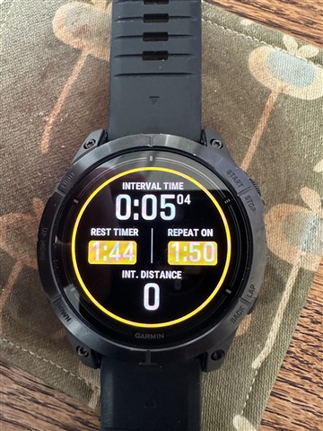
Since the last two updates, the Rest Time and Repeat On fields on one of the screens in my Swim workout have yellow backgrounds during rests, i.e., between intervals.  This makes the white text (numbers) unreadable, especially without my glasses when in the pool. They were readable before.

Has anyone else seen this change?

I have tried restarting, installing the latest update, resetting the workout to its default settings, and changing the accent color (which is unrelated and not yellow).

  • I've discovered this is "by design"...

    https://support.garmin.com/en-US/?faq=fXDWMUWcuw5ACMmLqjjC59&searchQuery=pool%20swim%20workout%20enhancements

    But my Epix 2 doesn't look like the redesigned rest screen on this page.  Instead of yellow rounded rectangles AROUND the white text, I have yellow backgrounds BEHIND the text, making it unreadable, especially in the pool and without my glasses.

    I totally get adding the yellow ring around the screen to make Rest mode more obvious, but PLEASE get rid of the yellow background behind white text, or make it an option!

  • This seems to be the company's official position:
    The illegible fields are a deliberate action by Garmin and the company doesn't care that users can't read these fields...

    forums.garmin.com/.../1916832

  • The illegible fields are a deliberate action by Garmin and the company doesn't care that users can't read these fields...

    Unfortuntely true. 

  • Did no one stand outside in the sunshine with tinted goggles and test this color scheme? This is just dumb and shows no one did a real world test. Simply make the text black on the yellow background so there it is not white text on a yellow background. 

  • The fact that no one has tested it is one thing. But Garmin has long maintained that the change is "by design" and that the fact that the field is illegible is fine. This is ridiculous.

    I recently managed to find out that they are collecting a list of customers who are pissed off about this change and will consider fixing it.

  • I haven't been swimming in a while and was ambushed by this change at the lap pool today. Selectively reducing the contrast on data fields this way, if by design, is bad design. I found it hard to read in full sun, even with clear goggles.

  • Garmin's approach to feedback from users is a joke ...

    But you can also try to report the issue to Garmin support in your country. The more reports they receive, the greater the chance that they will pay attention to us

  • After sleeping on this, I think I understand the "design" part of this. Like most other activities I use, this one places a colored ring at the perimeter of the dial to indicate paused and stopped states. The gold/yellow/orange color behind the rest and interval fields is the same as the pause ring at the edge of the dial, and may be intended to confirm the button press to pause (rest).

    However, moving from paused (resting) to stopped changes the ring to red, but leaves the field backgrounds as orange, so this theory may be wrong.

    If this is the intent.. placing a colored frame, a hollow ring, of color around those fields would be consistent with having the colored ring at the edge of the dial but also leave the dark background around each digit... win-win. It might not look stylish, though. Form follows function, I say.  I will file a report and suggest this in the report.

    (I should mention that I see this on a fēnix, not an Epix. It's the same.)

  • I agree with how you describe how it was supposed to work and look. And I really like your idea for solving this problem.

    In its current form, the graphic solution is not good in practice. About 30 people have reported on the forum that they have a problem reading this data in normal conditions of use, Garmin is aware of this problem and has not done anything about it for months. Are they doing this to spite us?

    You buy a watch for 1000€ and now you can't read the data while swimming because it is "by design". This is sick!