IDEA: Power and hr numbers color coded by zone

Former Member
Former Member

hi, 

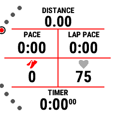
I'm cycling and running with my watch. I came from wahoo bolt2, I just like garmins map more.  I use my watch as a bike computer and it works great. But it lacks one feuter witch is amazing in wahoo bolt 2. It is color coded power and hr. Garmin offers gauges but they are really hard to read. Most of the time I ride in public roads so every second less looking on the road is a possibility of a crash or accident. So most of the time I just take a quick look to see what zone I'm riding. It would be amazing to have the possibility to have a color coded power and hr zones. It even can be only for a gauge, so it would show zones as it shows now but the power or hr number would be in same color as a zone. It should be not that hard to implement and it would be amazing to have. Garmin please consider adding this feature. And I hope many people will support me on this one. Even for running it would be amazing to just quickly look and see hr zone.

cheerz

  • On my 945 LTE, if I add the HR or Cadence Gauge to a field that's small enough, it just shows the numerical value and an icon (heart or sneaker), instead of showing a full gauge. The icon is color-coded (but not the number). I know that's not exactly what you had in mind, but does the Epix work like that and/or have you tried it?

  • Former Member
    0 Former Member over 2 years ago in reply to FlowState

    by color coded I meant it corresponds with your hr or power zones. So for example when you cycle endurance (inside zone 2) and your z2 is something like 180w-220w, all the power numbers have color of that corresponding zone like blue in garmins zone color code. And you don't have to see exact number. It is enough to see if it gets grey (z1) or green(z3) to push harder or easier. Same with hr. 

  • no option for that. Would suggest logging a feature request.

  • by color coded I meant it corresponds with your hr or power zones.

    That's what I mean too. In the screenshot above, I was standing still, so my cadence is zone is red (because it's way too low), and my HR zone is 0/1 (grey) -- the sneaker icon is red and the heart icon is grey.

    If I was actually running, the sneaker icon would be a different color (like blue or purple) and the heart icon would be blue or green (Z2 or Z3). I see it literally every time I go for a run.

    I don't cycle, but I checked the power gauge field with my Stryd and it works the same way - when the sensor isn't connected, the power icon is black, but when it's connected, it's grey (suggesting that it's Zone 1).

    That's why I asked if Epix works like 945 LTE in this regard.

  • Former Member
    0 Former Member over 2 years ago in reply to FlowState

    iI'll check that, thanks! :)

  • and my HR zone is 0/1 (grey)

    Would like to change this also. Don't like the grey...

    So interested also.

    LD 

  • and my HR zone is 0/1 (grey)

    Would like to change this also. Don't like the grey...

    Grey is the standard Garmin color for HR zones 0 and 1. (They don't differentiate between zone 0 and zone 1, unless you display your numerical zone.)

    Like I said above, if I were actually running, the heart icon would be blue or green (for zone 2 and zone 3). During a workout it could also change to orange or red (for zone 4 or zone 5).

    My point was that if you are looking for a color-coded HR/Cadence/Power field (where the colors correspond to Garmin zones), this is the closest you can get (on a 945 LTE at least) - add one of HR/Cadence/Power Gauge fields to a narrow data field.

    And if you do have a color-coded HR field (for example), it has to be grey when you're in zone 0 or zone 1 -- otherwise it wouldn't be color-coded based on HR zones, which is the point of OP's request. Garmin isn't going to change the color of zone 1 any time soon.

    I'm just guessing that maybe Fenix 7 and Epix have the same feature.

  • They do indeed have the same feature. 

  • I like the concept of the colour-coded icon better than colouring the actual number, as that can take away from the readability (e.g. red numbers on a black background). As mentioned, colour-coded icons already exist on some fields, but it would be good if they were present on any field displaying a zoned metric.

  • RunPowerWorkout IQ field has a good look, which is to colour the BACKGROUND, and have the number a contrasting colour.

    I don't think Garmin would ever go down that route with the desire to have black backgrounds and conserve battery consumption etc, but it's the most usable scheme I've tried. You glance and can immediately see what zone you're in outside of a structured Workout, or whether you're in target range inside a Workout.