The stamina feature is exciting. It has similarities to Xert. Xert has a superior way of showing the data however. Is there any way to get an easily digestible picture out of Garmin? For example, Xert seems to take 3s power, so the extreme peaks are not there. Also is combines area and line graphs effectively. And colour is used usefully. The colour that indicates efforts above and below FTP is particularly handy.
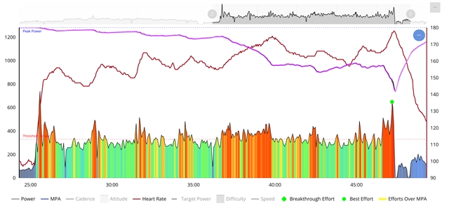
Here is Garmin Connect:
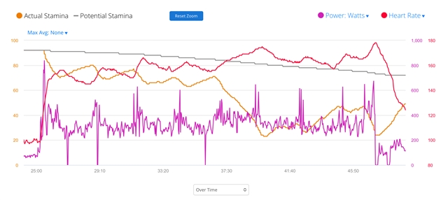
Here is Xert: