Watchface: Geneva

Note: I've removed this watchface from the app store, for a couple reasons.

  1. After putting many hours into it over the last month, I've decided that the "tip jar" approach simply wasn't working. Despite positive feedback, essentially nobody was willing to donate.  I developed this watchface primarily for my own use, but I found myself increasingly updating it based on the preferences of others, few of which were willing to donate anything to support the effort. So I plan on releasing a paid version, with a free trial. If people like the watchface they can buy it, if not they can move on. Suggestions for improvement are welcome, but if they are suggestions from people unwilling to spend a modest amount to purchase it, I have limited interest in putting in the time & effort.

  2. This was actually three watchfaces in one. That was an interesting technical achievement—it required an organized modular design to the codebase. But it's kind of pointless. If people want to change the watchface they should use the normal system menu to change the watchface. One of those things that's obvious in hindsight. So I will "split out" Geneva into at least two watchfaces available on the CIQ store.

Regards,
–nonparametric

  • There is no way (that I am aware of) to get a GPS location from GCM.

    CIQ 4.1 or 3.3 (both are "System 5" - there is no "CIQ 5" right now) can use the results of Weather.getCurrentConsitions().observationLocationPosition to get a GPS location for Weather.getSunrise/Weather.getSunset.  It's the phone's location and updates whenever weather is requested by way of the phone.

  • Thanks Jim, I should've just pinged you about this from the start. I will add this to the next update.

    In case there is any confusion: "CIQ 5" is shorthand for "CIQ System 5" in all instances in this thread

  • It's not a crazy idea. Can you point me to some of the other projects?

  • https://github.com/SylvainGa/crystal-face  is the best example, it's quite a popular download and has several active forks and at least a few different contributors. 

    https://github.com/samuelmr/garmin-abouttime  is another

    Using these (and other) available source code, I have created my own watch faces for personal use (my current running watch is 945LTE). But now I also have an EPIX and I really like your analog AOD face.

  • Love the updated hands for Chronograph in 1.3! To my eye, the hour tick marks look to have gone back to their original length/thickness - any chance you could go back to the shorter/thinner ones (which now appear to be in Black Tie)?

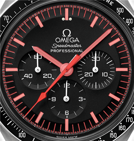
  • Right now the proportion of the tick marks for "Swiss Railway" and "Chronograph" are close to pixel-perfect copies of classic watches and I kind of like it that way. (The watch hands as well).

    [Update: On further investigation it looks like Omega changed the proportions of the tick marks on the Speedmaster moon watch design from year to year so there is a bit of leeway. I will play around with a couple designs and find one with smaller ticks.]

    "Black Tie" is basically the original version I released based on just eyeballing proportions, but I'm including it for consistency in case people liked the version 1.0.0 design.

    Another alternative: Can you point me to an iconic mechanical watch with tick marks and hands that you like? Ideally from a swiss watchmaker, just to stay "on brand".

  • Ok, I see how you are seeing the three different versions and it makes sense. On Chronograph, which is the one I like the most, funny you mention Omega Speedmaster Moonwatch because that's the one I like most of the classic Swiss brands - not sure whether it's the hour marks or the hour hand that is shorter on the watch itself but it looks like there's more space between the hour hand and the hour mark.

    Separately, I think the whole reason I brought up the of shorter hour marks without second marks in my earlier responses is because of the second tick marks that already are on the black surrounding bezel and viewing shorter hour marks as an extension of the hour marks starting from the bezel (the ones that read 60, 05, 10, etc). If looked at this way, there would be a bit more breathing space between the complications and the digital tickmarks. 

    All of that said, thanks for your level of attention to detail and sharing more about your design approach. 

  • The latest version (1.3.1) has the tick marks calibrated based on the Omega model you linked. The image below shows the actual watch with the "Chronometer" watchface overlaid in semi-transparent red. While I was at it, I also implemented the arrow-shaped second hand matching the Omega model.

    This model incorporates 4 tick marks in between each second tick, while the version I've implemented has only 2. This is because 4 subdivisions pushes the limits of the AMOLED screen resolution, but also because other Omega speedmaster models only include 2 subdivisions. For example,

    https://www.omegawatches.com/watch-omega-speedmaster-moonwatch-professional-co-axial-master-chronometer-chronograph-42-mm-31030425001002

    I'm not sure how that choice is made for the various models.

    (The version I previously used was the Omega Speedmaster "Dark Side of the Moon" 2021 model, which has significantly longer and wider hour tick marks:

    https://www.omegawatches.com/en-us/watch-omega-speedmaster-dark-side-of-the-moon-co-axial-chronometer-chronograph-44-25-mm-31192445101003

    )

    I personally  ignore the "built-in" tick marks on the Epix 2 bezel because they are very hard to read even in bright indoor light and of course impossible in darkness. I'm not entirely opposed to including a version with truncated tick marks, but I don't want to get into the business of rolling out a unique watch face for each request. The better route would seem to be including even more settings. But a spaghetti mess of dozens of settings also offends my sensibilities for a well-designed watchface. Will continue to think about the best way to approach that one.

  • Chronograph 1.3.1 looks fantastic!