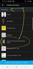
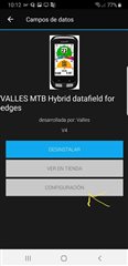
https://apps.garmin.com/en-US/apps/b388aca6-91a8-4453-a35a-daf6437f170c#0
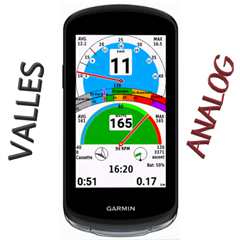
(I changed the name from "Valles MTB hybrid", because now I practice also road and gravel with my friends, so now it is just called "Valles Analog")
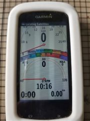
This is the evolution of my life on a bicycle and with garmin. I started monitoring my HR and bike speed on a vivoactive HR, and later upgraded to the Vivoactive 3, then I got an Edge 1000, a vivoactive 4, and now I got the fenix 7 solar and the edge 1040 solar. When you are with your Mountain Bike on the trails you need to have most of your attention to the road, and unfortunately with the small screen of the watch it was difficult to read all the variables from your ride like Speed, Cadence, HR, HR zones, etc. Looking into the available Datafields I loved the Analog implementation from Stanislav for the vivoactive but unfortunatelly it did not include the heartrate zones. So I decided to learn how to make my own Datafield. I believe that showing the numbers with an analog dashboard like those of an automobile, will let me understand the speed faster than when reading a number. So Implemented it for
- Speed
- Cadence
- Heart Rate Zones
- Power Zones
- Wind heading and speed
- compass
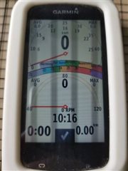
Hearth Rate zones are normally used for training, and they have a standard color, so I added the background of the speed to change of color depending of the Hearth Rate Zone I am. The color zones are as follow:
- Zone 1- Gray: 50%-59% of Maximum HR: Warm-Up/Cool Down & Active Recovery.
- Zone 2- Blue:60%-69% of Max HR:Endurance or long time effort maintained. Also it is believed that training on this zone you are using mainly your FAT as energy
- Zone 3- Green:70%-79% of Max HR: Aerobic zone where you don-t put so much stress of the muscle and can be maintained for long rides.
- Zone 4 - Yellow: 80%-89% of Max HR. Anaerobic zone where you energy come more than carbs than fat, muscle are fatigued around 1 hour after depleting your carbs reserves.
- Zone 5 - Red: 90%-100% of MHR. Maximum effort, it can be sustained for a very short period round 30 seconds to 3 minutes.
With a very quick view of the screen you can see on what HR zone you are on that moment when you memorize the colors.
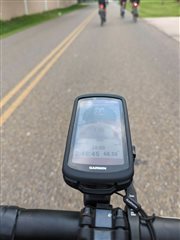
Later when I could purchase the EDGE 1000 and saw the big screen can let you put more information in there. I also noticed that the same concept for the watches applies to the cycling computer since your attention need to be always on the road, so a quick glance on the screen can let you know how are you performing.
And Now with my later acquisition which is a PowerMeter, I implemented the same concept as with the Hearth Rate zones. However Power zones are defined different than those from the HR, so instead of 5 zones we have 7. Instead of Max HR the FTP number is used:
- Gray- Zone for warming/cool down and also recovery. <55% FTP
- Blue- Zone for endurance or fat burning. Long distance rides. 57%-75% FTP
- Green- Aerobic zone or also called Tempo zone. or, 76-90% FTP
- Yellow- Lactate Threshold, normally for Time trial efforts. 91-105% of FTP
- Orange- VO2 Max , 106-120% FTP
- Red - Anaerobic capacity. >= 121% of FTP
- Purple- Max effort
Currently the FTP is 217 watts as default but on the "Settings" you can change it to your latest FTP. Unfortunately the power zones can not be obtained directly from your profile like the HR zones therefore it needs to be input manually.
4 years later I retook this app, but lost the keyh to update the original, so have to publish it again. This time I wanted to update it to work with the Edge 1040. At the same time I improved the look of it, fixed some bugs, and included a compass to know where I am going inside the trails, and when doing road or gravel a wind head and speed indicator.
 The idea is to know the wind direction so that we can better position on a road cycling behind your friend who is pulling. The arrow on the left is the compass pointing to the north, and on the right is an indicator similar to those found on airport, where the sack inflates more depending of the wind speed.. but also indicates wind direction. on this example the wind is coming from North/West.
The color of the indicator and the width of it changes accordingly to the wind speed. I used the Beaufort wind scale as a reference.
| thickness | color | definition | m/s | |
| 1 | Blue | calm | 0 0.5 | |
| 2 | Blue | light air | 0.5-1.5 | |
| 3 | Blue | light breeze | 2 - 3 | |
| 4 | Green | Gentle breeze | 3.5 5 | |
| 5 | Green | Moderate breeze | 5.5 8 | |
| 6 | yellow | Fresh breeze | 8.5 10.5 | |
| 7 | yellow | strong Breeze | 11 13.5 | |
| 8 | orange | Moderate gale | 14 16.5 | |
| 9 | orange | Fresh Gale | 17 20 | |
| 10 | Red | Strong Gale | 20.5 23.5 | |
| 11 | Red | whole gale | 24 27.5 | |
| 12 | Red | Storm | 28 31.5 | |
| 13 | Purple | Hurricane | > 32 |
Donations are appreciated.


