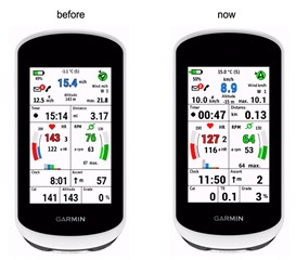
Yeah, I agree custom fonts aren't too hard once you know the drill... Using them for icons is a nice trick indeed btw!
But is there also an easy way to 'scale' fonts? Or create custom fonts which are half width of the original one? I know it is possible using an image editor to scale the png generated by bmfont and manually editing the corresponding .fnt file but that's pretty tedious (and sometimes tricky).
Strangely I have the same problem 7 years later on some of the latest devices (edgeexplore2, fr965) where the DF labels I draw using FONT_XTINY are bigger than the labels of the built-in fields.
Does anyone know a publicly available font (maybe on githib) that can be used for this?
On some devices with CIQ you can use scalable fonts, and set the height you want in your app. On others, you use a ttf file and bmfont, and create a custom custom font the size you want. To find the ttf, you can just do a simple search for something like "roboto font download".
If you search the discussion forum you find lots of info about custom fonts as they are used in many watch faces.
Here's one of the sites I use when looking for something interesting for a watch face: https://www.1001freefonts.com/
Not all fonts that the platform uses are exposed in CIQ on all devices, so if you want something different in your app, I'd first look at custom fonts. I know someone that tends to use them for all different app types and not just watch faces to make mult-device support easier.. And you don't need anything in jungles and just use resourse overrides like
resources-round-240x240
(all round devices with a 240x240 display)
resources-semiround
(devices like the fr23x, 630, 735)
The problem with this is this just adds one more thing that I'll need to figure out for each device. Currently I am more or less figuring this out from the simulator.json (both the font and the location for the label). It doesn't work too well, but if I'll use custom fonts then it basically means that I'll need to find out the font size for each device (and in case of datafields for each field...) Maybe it will be easier to find a good shrink and I'll care less about pixel perfectionism :)
Regarding Edge Explore 2 I was in contact with a user who owns the device (me not...), and I found out that the fonts on the real Explor 2 are much smaller as in simulator shown...

But the next bigger fonts of the device were too big.
So I build my own customer fonts.
Advantage of customer fonts: they look absolutely identical on Sim and Device.

I understand, and that's a perfect solution for a full screen app/DF but I have a few Datafields that only take 1 spot in the layout so they are shown next to the other, default fields like time, distance, pace, etc, that's why I try to be as similar as possible (on the other hand I also change the label dynamically, so I can't use SimpleDataField)
Possible fixes:
- shouldn't care, nobody notices the difference except me
- should start creating full screen Datafields
- shouldn't change label => use SimpleDataField
- map the label font sizes for each device, field (I do this partially from simulator.json but it's a mess and isn't perfect)