This discussion has been locked.
You can no longer post new replies to this discussion. If you have a question you can start a new discussion

Why is that page sooooo long and heavy ???

Another surprise from Garmin, and again not in a good way !!!!!

Can someone from Garmin tell me why the page linked below is sooooo long ?

https://developer.garmin.com/connect-iq/reference-guides/devices-reference/

It even makes some of my browsers crash !!!! This is just ridiculous. But that’s not even the point.

It didn’t cross your mind that the detail for each device could be on different pages ? Also because maybe I don’t have to load details for 300 devices while I’m only interested in 2.

Are the Garmin servers limited in pages ?

or you just think that we all have expensive computers and phones ?
Do you even test those pages on different devices ?

Come on again guys, be professional for once !!!

  • Once again, you both missed the point.

    as I wrote, they never reply when contacting them, been there done that.

    2) spamming ? you didn't have to read my post.

    why don't you both ignore my message since it is not for you ? You will feel better, and then people with a real answer to my post can feel better about giving their point of view !

    thx guys

  • I saw someone from Garmin reply to a bug report just an hour or so back.  That happens regularly.

  • So, it wasn't a timezone issue. And my post was not about them not replying instantly but bringing a proper answer to my different questions in less than a month...

    and regarding the tone of my posts, I tried posts without arrogance, and they are never answered either.

    so please stop spamming the post guys, because your replies don't solve anything related to the post itself.

    cheers

  • The response was probably 9am in Kansas, where the person that responded works.  So during his normal time at work.  So very much related to the time zone.  The CIQ group is based in Kansas

  • It will be my last reply to messages that don't relate to my post.

    once again, I don't mind a few hours !!! I mind a few months ! So let's wait and see how long it will take to get a proper reply from someone working at Garmin.

    someone who can tell an intern to separate HTML pages, so people who don't own a powerful device can still load the page they are interested in, without loading the other 300 devices details (not talking about the table at the top of the page)

    At your own pace Garmin !

  • Raise a bug report about your browser crashing giving details of browser and device and what’s it running on. The developer pages are also designed for desktop and quite a few get truncated on iPad etc as they are not responsive.  But anyway, raise a bug report for the crashing pages.

  • I agree that the UX of that page is bad. The fact that all the devices are on a single page isn’t bad per se, but:

    - as OP pointed out, the whole page shouldn’t be loaded at once. For a huge page like this, “infinite scrolling” should be utilized, where only the visible part of the page is loaded and rendered at any given time — when the user scrolls, the newly visible part of the page is loaded and rendered on demand. Crashes aside, infinite scrolling usually results in a better UX for large pages, as long as it’s implemented properly

    - there’s no navigation element, as often seen on sites with a very long page that’s broken into logical sections (e.g. look at any of DC Rainmaker’s huge reviews - there’s a floating table of contents which not only lets you jump to any of the sections, but it also indicates where you currently are in the page.)

    Of course it would be a lot simpler for Garmin to just split that one huge page into multiple pages. I agree with one of the comments that the concept of having all the devices on a single page isn’t bad, but the execution isn’t great.

    Also as already noted, there could be a hybrid solution where:

    - the device summary table at the top is still on a single page

    - each of the device details sections is on a separate page

    For an example of how the lack of a navigation element results in bad UX, consider this use case:

    - I open the devices page as linked in OP

    - I scroll down a little bit to find the device I want (e.g. FR965) in the top summary table, then click on the link to jump to more details about the device

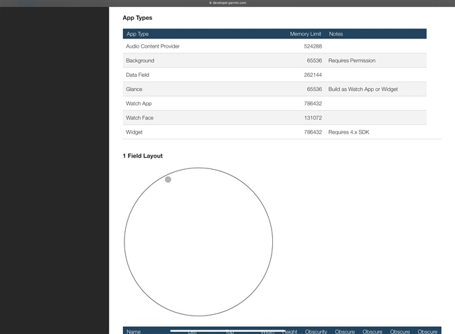
    - Now I scroll down a little bit to view one of the sub-sections under the device. It’s impossible to tell at a glance what device I’m looking at because there’s no navigation element or any other hints. (e.g. Each sub-section could have a title which reminds you what device you’re looking at. Or there could be a floating/fixed header which is always visible for the current section)

    e.g. In the following screenshot, it’s impossible to know what device I’m looking at (without guessing)

  • I agree with you.

    so maybe Garmin should hire a developer who can create pages with CSS3 and HTML5 in 2024 ;)

    Using sticky headers or navigation to always know which device you're looking at.

    Even an intern could do that, and definitely better than what that web page is now.

    That wesbite is ridiculous and outrageous for 2024.

  • I mind a few months ! So let's wait and see how long it will take to get a proper reply from someone working at Garmin.

    Hello—Garmin Connect IQ team member here. I'd like to provide some clarification about what can be expected on these forums (at least the Connect IQ-related ones), and then address the topic at hand.

    As others have said, the Connect IQ developer discussion forums are intended for Connect IQ developers to discuss and share information related to app development. We don't have staff dedicated to monitoring the discussion threads, so if a discussion was started months ago and no one from Garmin engaged, that's why. Occasionally, a thread (such as this one) will be brought to our attention, and we're happy to respond.

    The bug reporting tool, however, is actively monitored. We have some guidelines laid out that we ask everyone to follow so we have enough info to look into the problems that are reported, but that's the best place to report an issue like what's being discussed on this thread as mentioned in the response from Ultra.

    At this point, I don't think it's necessary for me to ask to submit a separate bug report about the device reference page—I'll get an internal ticket created and see what we can do. FWIW, I completely agree that the UX of this page could use some improvement (I appreciate 's suggestions). I suppose we haven't been more proactive about modernizing that page because it hasn't been an issue up to this point, but since more and more products are added every year, that page does seem to have become unwieldy.

  • Hi Brandon,

    that was unexpected ! But glad to read a reply at least.

    So I don't see how I could have created a bug report, since that page being too long is not literally a bug.

    Also, Garmin not having official changelogs is not literally a bug either.

    also, Garmin Connect IQ website not having proper filters (filtering out payment, or by device for example) is not literally a bug either.....

    So where do we start Brandon ???

    do we need to have a phone call or you guys can start using your products on a daily basis and see the "bugs" by yourself ?