Request for more stock options of graphical HR datafields

https://apps.garmin.com/en-GB/apps/4885b1e1-7102-4c66-8600-c69f911780d6

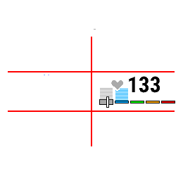
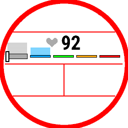
Garmin should implement this HR data field natively, so it doesn't use 1/2 of available slots. It's so much better than built-in graphical field for heart rate

  • This is available in the new beta firmware for current watches:

    https://forums.garmin.com/beta-program/forerunner-955-series/public-beta-bug-reports/i/public-beta-version-20-xx/heart-rate-zones-ratio---data-field

    EDIT: Here's a couple of screenshots from my FR955

    I feel like there's a bit of redundancy here (not unlike the heart rate gauge field):

    - the heart rate icon is color coded to indicate the current zone

    - but the current zone is also indicated by the white pointer (with more granularity than a simple color, as it roughly points to the part of zone that you're in)

    - the current zone is also indicated by the larger rectangle

    So that's 3 ways to tell you what the current zone is, and only one of them gives you more information than the others. Personally I would've preferred if they at least got rid of the heart rate icon as it really clutters up the field (especially in the layouts where the field is narrower and/or shorter.) But ig the icon is there for consistency (especially with the minimal version of the HR gauge field, which only has the number and the icon), and to give users a way to quickly see the zone in a part of the field that never moves.