Latest Explore update 4.16 breaks the gps track look

Hi all,

My only use case for Garmin Explore (because it's routing feature is far worse than others) is to use it as a history of where I have been. I really loved the way it showed the GPS tracks of all my activities on a single map. This allowed me to get a feel for how far different places are from each other, or the difficulty of one hike vs another.

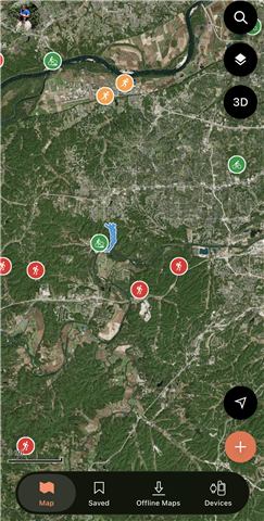
However, in the latest update Explore 4.16 Garmin apparently changed this to only show GPS tracks for the last seven days instead of all time, and now my map is clogged by giant icons.

Has anyone else had this happen? is there a way to return my app to displaying the useful gps tracks all together? Or even a toggle to choose which tracks are displayed in full. These giant icons scale weirdly, block each other, and don't allow me to really view my map.
  • The same thing happened with mine and I have the exact same use case as you. It used to offer a great personal heat map as well as a way to explore new areas by seeing where I've already been. 

    I haven't figured out a way to view all of the tracks again in settings. The odd gpx import I did are still there, so a clunky option would be to export activities in Connect to gpx, then import onto Explore web. Not ideal and not something I think I would end up doing for all of my activities. 

    It would be great to have the option to display all of the activity tracks. 

  • This was done by design to help with visual clutter that can happen when you have a lot of tracks overlapping. 

    You should be able to go Saved, selecting Activities > View All, find an activity, then press the 3 dots. There's a Show on Map option there which will allow you to see the tracks. 

  • Thanks for your reply. Is there any way to 'select all' to show all of the tracks? Or an option that could be considered adding?

    Selecting all of them individually is cumbersome, especially with a lot of activities and would mean waiting a week after the activity to then reenable the view track on the map.. 

    I also find the start point circles of the activities older than 7 days is just a massive clump that obscures the map more than the many activity tracks did.  

  • I find this new update infuriating and is definitely a major step backwards unless you give us the option to click all, I used the feature for Fell Running where you navigate from check to check point any way you want and I would run different routes and compare them on the map to find the fastest/most efficient route which would give me a huge advantage come race day

  • There is no 'select all' option in the app. The other option is to select an activity icon on the map > tap the 3 dots next to its name > Show on Map.

  • Could a feature request be made to have a select all option to restore the removed functionality? Or a user selection of how long a timeline of activity routes they choose to display on the map, such as a slider going from 7 days and increasing to All? That way the user could determine how they want their map displayed.

    For a user with hundreds of activities, selecting each individually to add them back to the map is not a helpful option. 

    I tried doing so, but any location where someone regularly starts their activity will have many of the point circles representing the start of their activity. Selecting each individually and adding to the map, both takes time, but once scrolling down the list to add to the map, the list of activities resets itself back to the top. So the user must scroll down to then find the last activity they have not yet added to the map. Once added to the map, the activity list again resets to the top of the list. 

    Adding them individually does not work very well. 

    I’ll also note again that if the intent was to reduce visual clutter, this update just changes the clutter from activity tracks to activity start point circles. Any location where a user regularly starts an activity from will have a massive clump of these circles obscuring the map. The main difference was that the activity tracks were useful to see, whereas the activity start point circles just block view the map. 

  • I actually like the new way of displaying activities in Explore 4.16.

    For example, a single activity somewhere in the Bavarian Forest is simply not visible on a country or regional overview map. The track is just a tiny line that disappears at that zoom level. You only see the activity after zooming in much further.

    With the new solution, you can immediately see that there is an activity in that area. And even better, the symbol tells you what type of activity it was.

    When you want to see the actual tracks, you simply zoom into the area where the activity points are located and use the search function to select Saved. The activities in that region are then displayed as tracks, essentially giving you the "heatmap" view that some users are asking for.

    Unfortunately, this feature is a little laggy at the moment, but the concept itself works very well.

    So for me, the new solution is actually an improvement: at overview level you can see where activities exist, and by zooming in and searching for Saved, you get the detailed activity tracks for that region.

  • Another advantage of the new system is that you can actually see every individual activity start point.

    With a dense heatmap, activities that were not started at the usual starting locations can easily disappear into the overall picture. For example, if the heatmap has a 30 km radius, activities close to the outer edge of that radius may not be visible at all, especially when there are many other activities in the area.

    With the new system, every activity start point within the area is clearly visible. This gives you a much better overview of where activities actually took place, rather than just showing areas with a high concentration of tracks.

  • I too find this feature incredibly frustrating, as I enjoyed seeing the lines rather than a massive blob of dots. A mass-change feature is needed.

  • It is really poor that no one at Garmin thought through the impact of this change on app users. Those of us with hundreds of saved activities cannot seriously be expected to click each individual activity to undo this change.
    A select-all option to allow routes to be show needs to be at the top of the list for the next update.