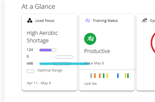
Looks like there's a problem with the Aerobic Load Focus. Why is it crossing into the Training Status? This thing's a mess.

Looks like there's a problem with the Aerobic Load Focus. Why is it crossing into the Training Status? This thing's a mess.
Probably because they had a fixed release date they had to make no matter if it's done or not.
Yeah, the connect web page has a few bugs for sure. Note the numeral being cut off on the activities tile. I let them know, but have yet to hear back about it. Also, this tile looks tidy as *** but provides…
I spoke to Garmin about this formatting problem yesterday. At first they seemed to think it might be a display setting on the user end. I was able to let them know I'm using all windows default settings…
I spoke to Garmin about this formatting problem yesterday. At first they seemed to think it might be a display setting on the user end. I was able to let them know I'm using all windows default settings for my screen resolution etc.
Nice - try to blame the consumer first rather than take responsibility for an app that doesn't function as it properly.This whole mess should have stayed in beta until these issues were worked out.
display setting on the user end
Yea so what, people use different font sizes, if an OS supports that you have to deal with it as an interface designer.
I spoke to Garmin about this formatting problem yesterday. At first they seemed to think it might be a display setting on the user end. I was able to let them know I'm using all windows default settings for my screen resolution etc.
Yeah, clearly the problem is that the graph is scaled to always fit the optimal range with the highest upper limit, without considering that one of the actual values may be higher.
All they have to do is take one look at the screenshot in the OP to see that it’s not a problem that’s caused by display settings (although I agree that this stuff should work with a range of display settings — obviously extreme cases like gigantic 500% text may not look right.)
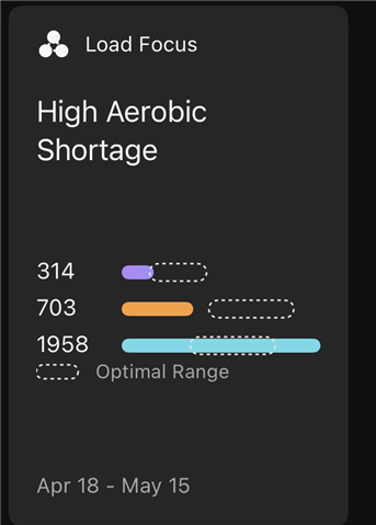
The problem is even more embarrassing considering it’s not present in the mobile app.
And ofc they should be able to easily recreate it on their end assuming they have the ability to produce synthetic data for testing. But trying to actually fix problems is always the last resort.
Here’s an apples to apples comparison with the same data (I took these screenshots within minutes of each other.)
Mobile app (graph is scaled perfectly - everything fits):

Website (graph is scaled poorly - only the optimal ranges fit, not the longest bar for the actual values):
I have to question if they’re even sharing as much code between the two as they possibly could. Notice how 1958 has a comma in the website but not the app. And how:
- the Optimal Range legend is aligned differently between the website and the app
- the tiles have different amounts of whitespace above and below the middle section with the numbers and bars
- the fonts are different
There’s also a date discrepancy where the app says Apr 18 - May 15 but the website says Apr 18 - May 16.
The website is half right because today is May 16 for me (local time) and I know for a fact that I saved an activity before taking the screenshot, and it affected my training load (so the training load includes today)
But Apr 18 - May 16 (inclusive) is a 29 day period while Apr 18 - May 15 is a 28 day period. 28 days makes sense because it’s exactly four weeks. 29 days does not make sense.
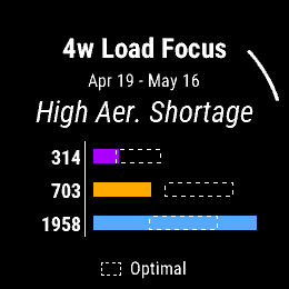
And in fact, the load focus of the training status glance on my watch says Apr 19 - May 16, which is clearly the correct 28 day range that includes today:

Note that this graph is scaled properly as well (you'll have to take my word for it that everything fits in the round frame of my 955, which looks a lil different than this square screenshot).
But I'd love to see Garmin explain how they could possibly fail so hard at something as simple as displaying the date range for the last 28 days (where a different range is displayed in each of 3 places.). Yeah I get dates and times are hard but do they test anything?
When I see "little" bugs like this, I always question why I should expect the important stuff to work if the "easy" stuff is clearly broken. Same as when a company's website, social media or app has blatant spelling or grammatical mistakes.
Ofc it doesn't matter bc nobody expects anything to work properly anyway.
Nice - try to blame the consumer first rather than take responsibility for an app that doesn't function as it properly
The same thing happens on the forums, especially in discussions about 3rd party development. Any time there’s a bug report, the knee jerk response from long time posters is that it’s actually a problem with the person reporting the bug.
FlowState is exactly right. Having numbers formatted 2 different ways i.e. comma or no comma, is a rookie mistake. Years ago I was in charge of designing a database for the company where I worked. One of the most important things to do is take a step back and look at your work as if you're looking at it the very first time. Confirming formatting, fonts and resolutions all play nice with each other is huge. There is absolutely no doubt in my mind that this was rushed to market. They should also find a new set of Beta testers because whoever did this testing really let them down.
Having numbers formatted 2 different ways i.e. comma or no comma, is a rookie mistake.
Yeah I don’t care about the comma per se, to me it’s just a symptom of a bigger problem (lack of attention to detail), same as the fact that at least when I took those screenshots, the current 28-day training load period was represented in 3 different ways:
Apr 18 - May 15
Apr 18 - May 16
Apr 19 - May 16
Ofc one could correctly point out that it’s not important and most people won’t care, same as the cosmetic issue with the load graph. But where do you draw the line? Is any of the “important” data reliable? If it isn’t, why buy a Garmin in the first place?
As a runner I’m pretty sure the only reason new runners buy garmins is because their runner friends use garmin. Said this many times, but many ppl I run with can’t even use the most basic features of their watch, like opening settings or opening the music player. That’s got to be why Garmin introduced an easier way to open activity settings after an activity is opened but before it’s started.
And it seems that many casual / new runners are happy with Apple Watch.
Apple isn’t immune to criticism, but nobody can say they don’t pay attention to detail. On the contrary, they’ve sometimes focused on aesthetics and UX at the cost of functionality or reliability. With Garmin, I think a lot of issues are disregarded bc Garmin has the features they want, or they’re otherwise locked in to the ecosystem.