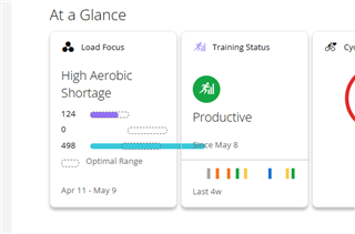
Looks like there's a problem with the Aerobic Load Focus. Why is it crossing into the Training Status? This thing's a mess.

Looks like there's a problem with the Aerobic Load Focus. Why is it crossing into the Training Status? This thing's a mess.
Probably because they had a fixed release date they had to make no matter if it's done or not.
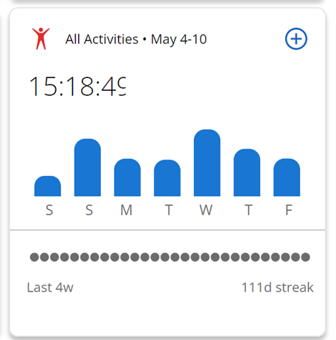
Yeah, the connect web page has a few bugs for sure. Note the numeral being cut off on the activities tile. I let them know, but have yet to hear back about it. Also, this tile looks tidy as *** but provides…
I spoke to Garmin about this formatting problem yesterday. At first they seemed to think it might be a display setting on the user end. I was able to let them know I'm using all windows default settings…
Why does it show me yesterdays ride on the Dashboard but when I want to look at the last 7 days yesterday's ride and the other 2 I did this week don't show up?
Yes. But they keep informing us that it's more customisable and filled with detail now. I guess they figure if they keep repeating it, it will become fact.
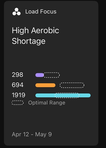
Ironically the same tile renders fine in the mobile app (with similar data, where the highest actual value is larger than than the highest upper limit for an optimal range. I thought the point was to unify mobile and web development to cut costs? Guess it’s not as easy as it looks on paper.
To me it looks like the mobile app was tested but not the website.

Yeah, the connect web page has a few bugs for sure. Note the numeral being cut off on the activities tile. I let them know, but have yet to hear back about it. Also, this tile looks tidy as *** but provides zero in the way of actual detail/information. Useless space holder. Absolutely pointless. Lordy, the new dashboard sucks.

zero in the way of actual detail/information
Yes and there is 7 of that type in "in focus", if you don't count them there is only 5 useful ones left, and the webinterface can show 6 at once, that's my point that there isn't even that much useful items in that category to fully use it.
They could improve this by coloring the bars in different colors per activity type and if you click that colored section a list of activities would pup up and you could select them for viewing. Similar to what you get when you click it now, but this is just pointless,