This discussion has been locked.
You can no longer post new replies to this discussion. If you have a question you can start a new discussion

Poll: How would you rate the new web interface?


Moderator: Please everyone let's try to keep the discussion civil and on topic. Expressing our dissatisfaction with Garmin is welcome, but name calling, and insults will not be tolerated. Those posts will be removed. Eventually the thread will be locked if it cannot be controlled. Please review the Terms of Use for more details.

Thread now locked. If desired, please start a new thread, but please remain on topic, cordial, and respective of other opinions.

  • Where's my weight curve ?
    Cannot put it in Focus (why ??????)
    Weight is in an activity tag, and to see its curve : click click click....


    Rollback to the previous interface, thanks

  • Where's my weight curve ?

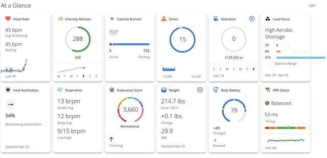
    Health Stats such as weight, blood pressure, calories, etc., are in the At A Glance section. If you place weight as the top/left card, should be fairly easy to quickly access from Garmin Connect Web or phone app.

  • Where do we respond to say we found MORE data, not less; that we found all the customization we need and that the web interface is landscape ?  Can we scrub 90% of these comments from people who don't make the effort to LOOK and LEARN.

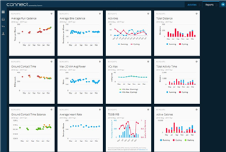
  • The inability to view data for a particular day completely breaks my workflow. *Most* metrics are available somewhere, but the blocks need customization options (let me define which specific metrics I desire, whether I want numbers or a chart, basically the same way we set up pages on a watch). Needing to click a block to get the data I want than have it on the dashboard is unacceptable for a dashboard. There shouldn't be limits on the number of blocks displayed.

  • OK. So a useful comment. You want a more horizontal architecture, rather than vertical. Needs a different logical data model.

  • Yet you miss the fact DATA is nolonger show in a convenient way that suits folks...If it was as simple as you actually say there would be far less complaints throught the hundreds of forums, groups and websites  out there all striving to  get the best out of this like they UESD TO ALREADY HAVE..And theres the point. IT WAS ALREADY GOOD ENOUGH with everything there in away that made sense.... Now its a half back, dumbed down fisherprice app/web thats barely is suitable.. and heres the Kicker, My wife use's Xaiomi MiBands and she always like Garmin app, Now I am the one wish I had everything she now has...Thats how pathetic this has become.

  • new vs old

    Old - Served us well for many years. No complaints, but time to move on.

    New - Even better. Some minor complaints, which were resolved after providing feedback early on in the beta process.

    I know, very unpopular opinion. I'll downvote myself just to get it started.Smile I suspect not a lot of people that are OK with the new Garmin Connect are flooding the forum to say how great it is. Just the nature of forums, I suppose.

  • Totally disagree... there are just so many "common sense" issues that people have. Start with spacing for God's sake! I do not know one person happy or even "ok" with the new one... This appears to be a case of "we've spent so much money and time on it, it has to be good" mentality...

  • " I suspect not a lot of people that are OK with the new Garmin Connect are flooding the forum to say how great it is. Just the nature of forums, " 

    You made that comment to troll everyone and to justify the massive lack of positivity.. All of which is echoed even on review and activities sites ran by professionals let alone the forums.... 

    as to this part "New - Even better. Some minor complaints, which were resolved after providing feedback early on in the beta process." you must be look at very differnet beta report backs to everyone else as it was overwhelmingly Negative ..

    You are in the very small minority if you do like it...